
 comms open!
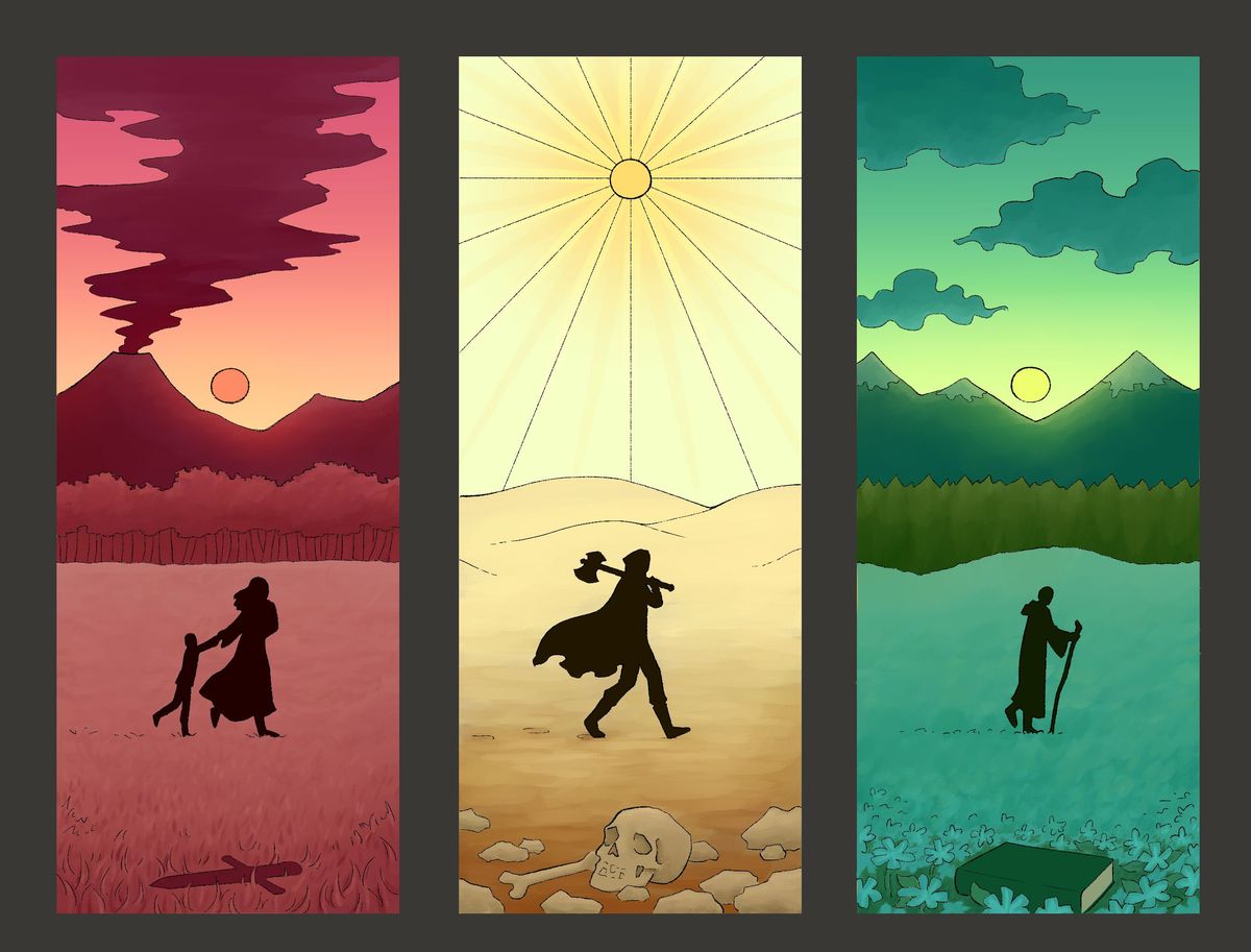
portfolio thingy wip
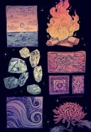
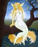
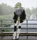
Do you think the silhouettes are to dark compared to the other colors?Any feedback and constructive criticism is very welcomeJan 29, 2022
#wip
#drawing
#digital
#digitaldrawing
#myart
Comments

Hmmm, i think that maybe if you want a little less "BOOM CONTRAST!!" with just the all-black sillouettes, you can maybe try doing a darker shade of each corresponding colors for them? So like for the first one, it can be a dark shade of red, the second one a dark yellow/brown and dark green for the last one?
Or you could try a gradient too where its light-ish to dark along the corresponding panel colors too. Just some suggestions

Or you could try a gradient too where its light-ish to dark along the corresponding panel colors too. Just some suggestions
•
•This looks really neat I think the fact they are dark really drives the eye the on them so its not bad at all!


•
•