@coffinthusiast's post on Artfol


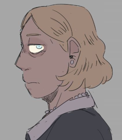

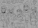
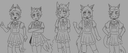
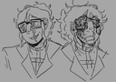
Waa I saw someone else do this and I also wanted to. Rate me on a scale from 1-10 in terms of color, composition, anatomy, fluidity/vibes, design, and lines! I wanna know what to improve on so b brutal and if u can think of anything else lmk! Rip me to fucking shreds!Jul 13, 2021
#question
#questions
#critique
Comments
I’m bad at math no numbers for you... just. Buckle in this is long as shit.
(Your art is already good, so I had to get nitpicky.)
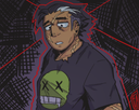
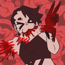
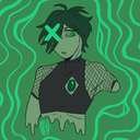
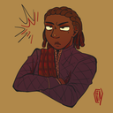
Ok so your shapes are very dynamic. Form, composition, silhouette, however you want to put it, the overall shapes convey a lot of tension and personality. They have weight. I think that in comparison, your lines tend to hold back their full potential. They’re not bad, it just looks like your lines are attempting a different style than the rest of the artwork.
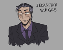
Whether it’s varying line weight, using thicker outlines and thinner details, using a more textured brush, contrasting straight angular edges with softer curves, tapered ends, etc, etc,,, I think a little more variation would suit the style everything else is already leaning towards. The lines as they are feel like they’re done by someone who primarily specializes in traditional ink nib cartoon character portraits while the rest is giving bo en chainsaw man amv (you know the one). Both good, just on opposite ends of a stylistic spectrum.
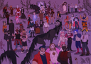
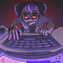
Composition and poses are good, but most need a bit more room to breathe. It seems like the close up, almost claustrophobic feel is often intentional and helps emphasize the foreshortening, but it can also create awkward tangents where the edges of the subject nearly touch the frame. It detracts from the dynamic poses when the viewer’s eye is naturally led away from the focal point by whatever odd limb is nearly escaping the canvas.
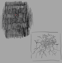
Speaking of composition, Backgrounds! There aren’t any. And that’s perfectly fine because your art is character-centric, but trust me it’s a pain in the ass to start adding backgrounds to your drawings only after finally settling into a style you’re comfortable and happy with because suddenly there’s a huge disconnect between character drawing skills and the everything else skills. Since it’s your art and you get to decide what it looks like, there’s no need to add backgrounds ever if you don’t want to, but for the purpose of overall improvement, it may be a good idea to start including them more often.
Color palettes are near perfect. If anything, vary the values enough so that the contrast would still be striking in greyscale. The hues and saturation work perfectly together, but a lot of large expanses of color are very close in value and it can look slightly washed out despite the unique color choice.
Vibes are very strong, the colors and facial expressions help with that. It’s always clear what you’re intending. Like I said, it’s full of personality. (Specifically it begs the question ‘what if arcade carpet patterns were an energy drink flavor?’)
Anyway, take it all with a grain of salt. There’s only so much to comment on regarding technical skills before it starts to kill what makes a style unique. Skill improves naturally with practice and everything I’ve said about style is entirely subjective. Whatever you like to do, keep doing it.

(Your art is already good, so I had to get nitpicky.)
Ok so your shapes are very dynamic. Form, composition, silhouette, however you want to put it, the overall shapes convey a lot of tension and personality. They have weight. I think that in comparison, your lines tend to hold back their full potential. They’re not bad, it just looks like your lines are attempting a different style than the rest of the artwork.
Whether it’s varying line weight, using thicker outlines and thinner details, using a more textured brush, contrasting straight angular edges with softer curves, tapered ends, etc, etc,,, I think a little more variation would suit the style everything else is already leaning towards. The lines as they are feel like they’re done by someone who primarily specializes in traditional ink nib cartoon character portraits while the rest is giving bo en chainsaw man amv (you know the one). Both good, just on opposite ends of a stylistic spectrum.
Composition and poses are good, but most need a bit more room to breathe. It seems like the close up, almost claustrophobic feel is often intentional and helps emphasize the foreshortening, but it can also create awkward tangents where the edges of the subject nearly touch the frame. It detracts from the dynamic poses when the viewer’s eye is naturally led away from the focal point by whatever odd limb is nearly escaping the canvas.
Speaking of composition, Backgrounds! There aren’t any. And that’s perfectly fine because your art is character-centric, but trust me it’s a pain in the ass to start adding backgrounds to your drawings only after finally settling into a style you’re comfortable and happy with because suddenly there’s a huge disconnect between character drawing skills and the everything else skills. Since it’s your art and you get to decide what it looks like, there’s no need to add backgrounds ever if you don’t want to, but for the purpose of overall improvement, it may be a good idea to start including them more often.
Color palettes are near perfect. If anything, vary the values enough so that the contrast would still be striking in greyscale. The hues and saturation work perfectly together, but a lot of large expanses of color are very close in value and it can look slightly washed out despite the unique color choice.
Vibes are very strong, the colors and facial expressions help with that. It’s always clear what you’re intending. Like I said, it’s full of personality. (Specifically it begs the question ‘what if arcade carpet patterns were an energy drink flavor?’)
Anyway, take it all with a grain of salt. There’s only so much to comment on regarding technical skills before it starts to kill what makes a style unique. Skill improves naturally with practice and everything I’ve said about style is entirely subjective. Whatever you like to do, keep doing it.
•
•Color: 7.8
Composition: 9
Anatomy: 7
Vibes: 9.5
Design: 7
Lines: 10
I love your lines so much ngl-
I feel like most of your art has solid vibes, definitely wouldn’t call them lifeless in the least :3
anatomy-wise, I don’t think it’s particularly bad, but sometimes parts makes me do a double take.
For design, I just don’t see much interesting stuff, maybe try getting a bit more creative sometimes, explore your options!

Composition: 9
Anatomy: 7
Vibes: 9.5
Design: 7
Lines: 10
I love your lines so much ngl-
I feel like most of your art has solid vibes, definitely wouldn’t call them lifeless in the least :3
anatomy-wise, I don’t think it’s particularly bad, but sometimes parts makes me do a double take.
For design, I just don’t see much interesting stuff, maybe try getting a bit more creative sometimes, explore your options!
•
•