
 Yummy cuties and bodies lover
 OC series”Chaos and Cosmos”

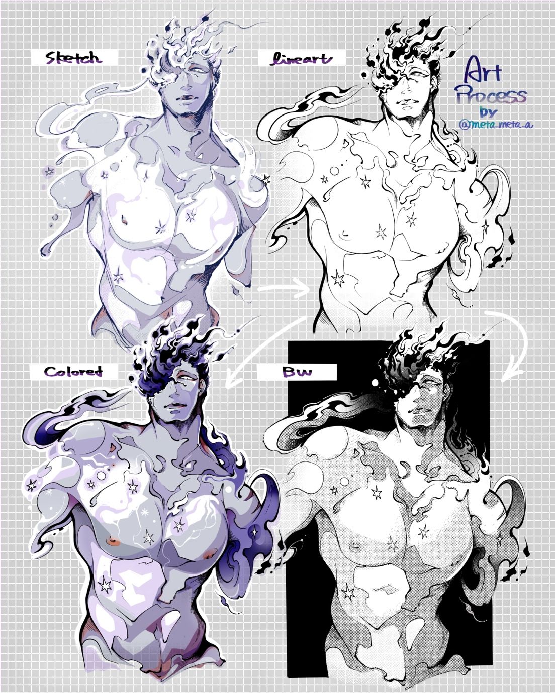
Meta’s character art process
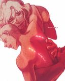
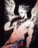
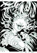
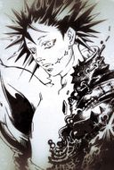
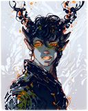
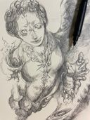
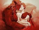
Have you thought “sketch is better than line art?”, “I may not need colors...”, I often struggle with each process and make many variations against my resolutionU;;;This time I made a process seat of my oc Chaos,(he’s my big motivation=good motif), there are two finished images; colored and monochrome. Which one do you prefer? And tell me the reason why.
Plus!
If you notice the way to improve these images, please give me critics
 Apr 16, 2021
#artprocess
#oc
#nude
Comments
I love both of them but definitely would go for bw as its easier to work on bw values. A quick finished work would be benefited from bw and bw looks are always timeless haha
•
•My favorite is the colored one. It looks more finished, more.. Deep to me. But it's just my opinion, it depends on everyone's taste and probably also on what do you want to transmit with your art :) 

•
•in my eyes each of them offer different vibe for story. so depending in what tone you wish to tell the tale you would choose accordingly. they all are impactful. just different impressions.

•
•

I'm obsessed. Your art has such an amazing range. My favorite of these is the BW one it feels more somber.
•
•Hot..tamale he is fine. Oh he’s so fine
Oh my gosh you had my breath hitch in my throat. けっこんする!

Oh my gosh you had my breath hitch in my throat. けっこんする!
•
•The couloured one looks amazing, to me it is the best, maybe if u added a little bit more of that orange it would pop a little bit more, bue the anatomy look stunning, congratssss

•
•I like your style in all of them! Personally I would see a mix of colored and be fit just right. Meaning that a little texture could pair amazingly with your art style

•
•I prefer the black and white version, it has a certain “ethereal” “magical” “classic” quality to it. And I really like how the rough texture of the trame constrasts with how delicate the linework is, without taking away from it.
I feel like the colored version is too “precise”, that the way the colors are applied (no gradient) goes against how ethereal the character is, it leaves nothing for the imagination.
I... yeah, I actually like the colored sketch better than the color final. The colored sketch is giving me final fantasy concept art vibe.

I feel like the colored version is too “precise”, that the way the colors are applied (no gradient) goes against how ethereal the character is, it leaves nothing for the imagination.
I... yeah, I actually like the colored sketch better than the color final. The colored sketch is giving me final fantasy concept art vibe.
•
•Hmm, I like the colored version more because there are more intricacies to his skin / design than in the monochrome version. You can see everything better?

•
•It’s really interesting to see your art process ! I think it’s the first time a colored sketch. Also for the finished pieces, I had a little preference for the B/W version with the use of screentones though I love the colored version too ! Btw, I can’t wait to see him more with Cosmos !
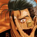
And this is not really a critique but I find that the shading on his left pectoral (in the finished colored piece) made it bulkier
And this is not really a critique but I find that the shading on his left pectoral (in the finished colored piece) made it bulkier
•
•You have a very cool rendering style! I'd say the bottom two are my favourites! The bold lines on the coloured (and lineart) version and the dark background on the BW add a really nice amount of visual contrast. That coupled with the shading generates a lot of visual interest (at least for me).
I think my favourite is the black and white because I really like the texture you added. I especially like the area around his neck where the smoke helps define the linework along the character's edge.

I think my favourite is the black and white because I really like the texture you added. I especially like the area around his neck where the smoke helps define the linework along the character's edge.
•
•I honestly love both versions, but for the sake of choosing, I’d say I prefer the black and white finished drawing! For what it’s worth, I don’t think there’s much to critique, but I do notice that between the colored sketch and colored finished piece, there’s not a significant difference, whereas the b&w counterparts show a big change. I believe that lies in the value change — consider pushing your darker values on the colored sketch so that there will be a more significant contrast and the eye can move across the character more willfully. You have such compelling lineart, but it’s lost when the purple and grey are so similar in depth. Beautiful work, as always, btw!

•
•First off Chaos looks amazing, very aptly named if I may say so. My preference leans more towards the monochrome version, maybe because the black background makes it feel more as a whole to me? And I genuinely like the mood it sets. That being said I think it's really great that you are experimenting like this, I feel inspired to go and try myself!
•
•A yes I totally get that feeling
The entire mood and energy just feels drained when u see the final results. And also he is rlly handsome I must say
I cant wait to see his interactions with cosmos

The entire mood and energy just feels drained when u see the final results. And also he is rlly handsome I must say
I cant wait to see his interactions with cosmos
•
•I honestly love all of your phases - even the unfinished ones for sketch and lineart, I feel like the sketch version looks like it's made of glass, and they all have their own special charm!  the b&w makes him look more menacing, but I personally prefer the coloured version for its liquid, pretty look/effect
 the b&w makes him look more menacing, but I personally prefer the coloured version for its liquid, pretty look/effect
 •
•Your art process is really interesting! Both are really good but I will say monochrome as I prefer the contrasts it has!

•
•oh my god yes, I think that every time I draw.
I must say they all look amazing But if i must decide on one I would say I like the coloured one the most, I think the colours make the Character feel a bit more "alive" and because I just love the way you used the colours.

I must say they all look amazing
But if i must decide on one I would say I like the coloured one the most, I think the colours make the Character feel a bit more "alive" and because I just love the way you used the colours. •
•