@PecheSucree's post on Artfol



 you can call me Peche | 22 | she/they | i draw things that i like
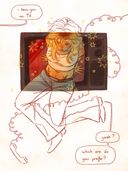
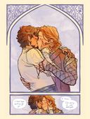
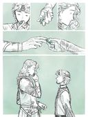
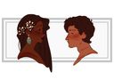
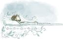
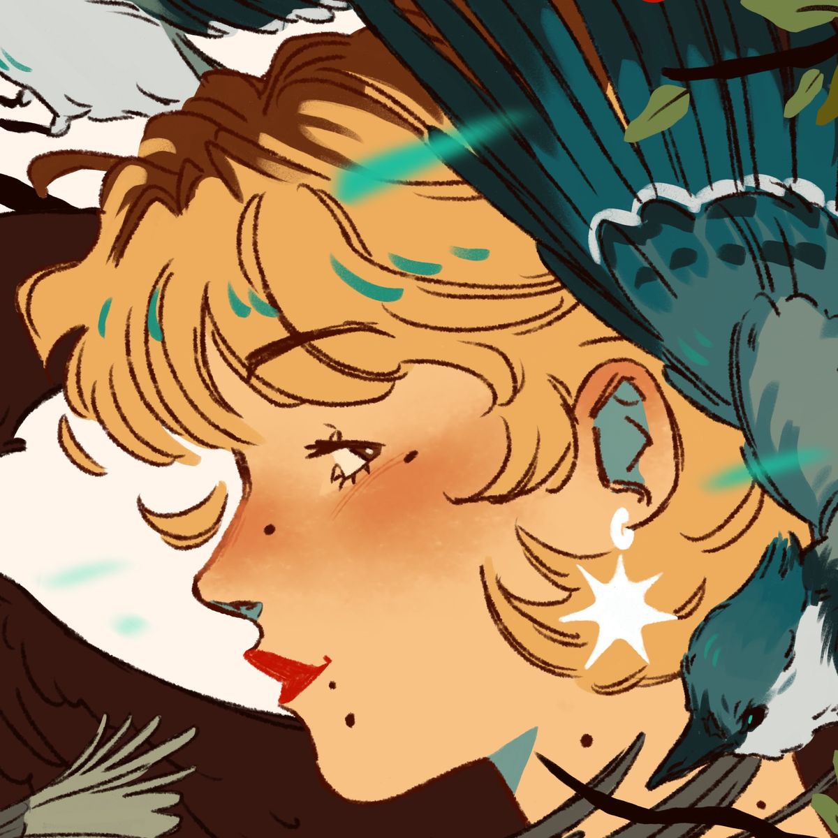
I just discovered the pain of the difference of saturation between my art on my computer vs on my phone
I hate itJun 28, 2023
I hate itJun 28, 2023
Comments
It's something that will never be fixed since everyone owns a different device with different settings so I usually don't even bother fixing the hues. Any type of device shows differently and humans see colors slightly different as well ^^ don't overthink it too much!
As long as you're comfortable with how it looks on your own devices that's fine ️
️


As long as you're comfortable with how it looks on your own devices that's fine
️•
•I used to have this issue with a previous android tablet but now, the samsung tablet I have uses CMYK colors, so it looks good on screen and when printing! Tbh, it was quite a surprise when I discovered it, though!

•
this- i always overcompensate for the saturation on my ipad so it looks okay on my computer 

•
I used to have that problem, but my drawing tablet (it has a screen) and phone have a similar saturation. And the laptop I have now has a similar saturation as well
But yeah, I remember the struggle, had to edit a lot of them on my phone

But yeah, I remember the struggle, had to edit a lot of them on my phone
•
It’s such a struggle especially when designing acrylic charms since you gotta do it in CMYK. It’s like being Gaslit by colors and I hate it!
 especially when designing acrylic charms since you gotta do it in CMYK. It’s like being Gaslit by colors and I hate it!
•


Same, recently realized most of my animations look dull and sick cause i had a warm tint on my phone 

•
That sucks!! I’ve run into that too, with my iPad vs my computer vs my phone it’s the worst

•
NO BC SAME— the absolute pain of editing them on my phone to fix it but it’s never the same 

•
•