
 Yummy cuties and bodies lover
 OC series”Chaos and Cosmos”

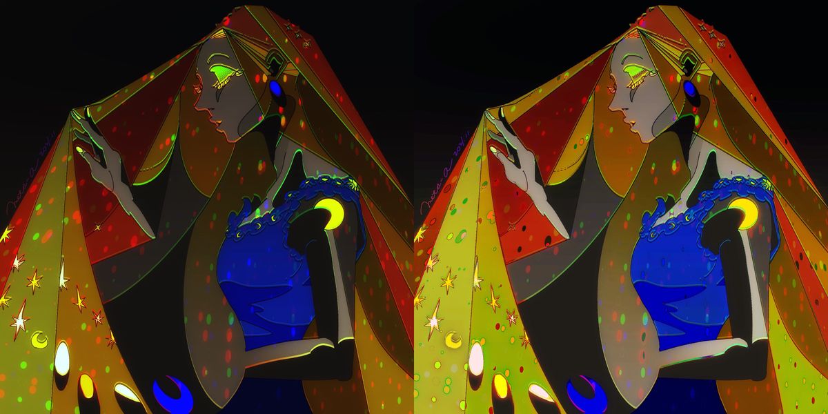
Soirée
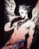
【My oc】The incarnation of Night and light
Which do you prefer, darker and lighter?Nov 24, 2021
#oc
Comments
wow im late for this but both are beautiful and love them!! but if u ask me, i think the darker one suits more the atmosphere, u know? there's no-light but still visible 

•

I prefer the darker one, but I think on either deign variation it's really difficult to tell where Soiree's body ends and where their cloths begin on the torso. There seems took be an arm shape cutting through the blue shirt, but I can only see 1 hand (and for that hand I can't see the forearm.) Even if Soiree is an illusory, trippy character, it's important that a first time viewer of them can tell what they're looking at. (Maybe this is just an unclear angle to view the character design from.)
I think the color choices add a nice clarity to the design. As much as I might like the darker design, it might make more sense for Soiree to have the ability to adjust their brightness, since they're a spirit of night AND light

I think the color choices add a nice clarity to the design. As much as I might like the darker design, it might make more sense for Soiree to have the ability to adjust their brightness, since they're a spirit of night AND light
•
•Wow so pretty!
I think I prefer the light one bc it feels like some of the shapes merge in the center especially around fhe face. But I really enjoy how much the little stars pop out on the darker one.

I think I prefer the light one bc it feels like some of the shapes merge in the center especially around fhe face. But I really enjoy how much the little stars pop out on the darker one.
•
•
Love the depth on the dark one, and the boldness on the light. Do I gotta choose? Lol

•
•


The dark one has really interesting lighting, like they’re sitting in a dark room! The lighter one is easier to distinguish the shapes, but I think you can achieve that with the dark one by creating more contrast

•
•I personally think the lighter version is easier to see, with ghe dark version I have trouble finding the figure

•
•The dark version looks like she is illuminated by the stars that are on the fabric. The light version feels like she is front of a light projector.
Both are pretty nice for me. But the dark version is more elegant.

Both are pretty nice for me. But the dark version is more elegant.
•
•I think you might want to add stronger lighting on the face of the darker one since dark skin is really reflective. Right now, I don't want to make a decision since I feel you can push the darker one a little bit more lighting wise.
Really interesting concept

Really interesting concept
•
•Oo how beautiful! I do like the lighter one since I can see the character clearer but the dark one has an appeal since it allows the eyes and the moon symbol to shine out more.
:0 Either way it's really nice.

:0 Either way it's really nice.
•
•