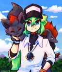





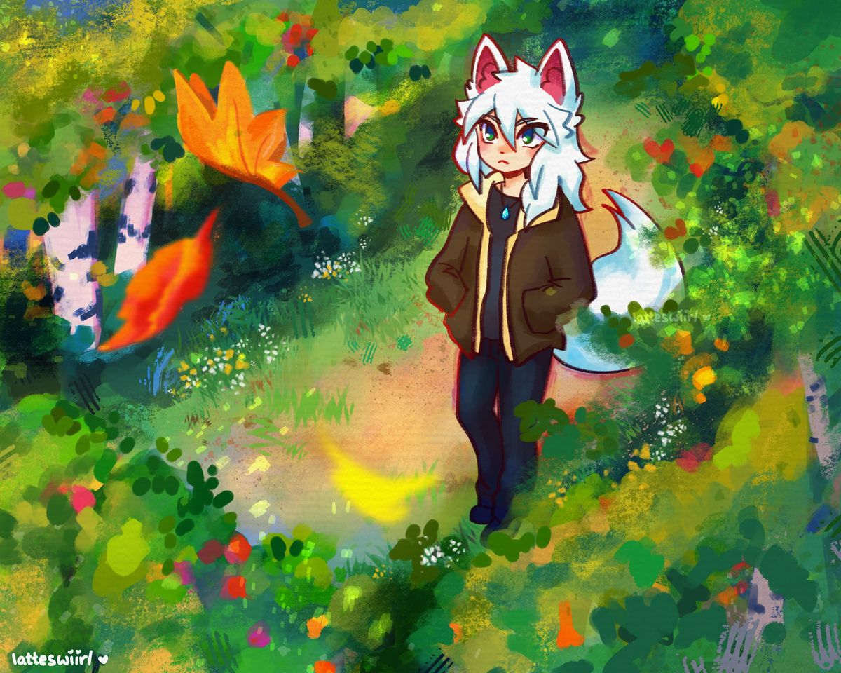
early autumn forest stroll
i like how this turned out but i'd love to know, in case anyone has any pointers, how i could improve in building the environment around him, establishing clear top-down perspective showing the closeness of the treetops' leaves vs the ground, how to improve the lighting, etc lol. open to critique!Sep 7, 2023#latteswiirlocs
#characterscene
#originalcharacterart
#kemono
#forest
Comments
First of all, I love your impressionistic style of coloring backgrounds! Like other commenters, I do agree that there’s issues with scale, which could be fixed by making Arden smaller, adding more perspective to the trunks and making the leaves larger — adding more detail would help too, since seeing just splotches of color to imply the leaves without defining their shapes in a more representational way gives the sense that we’re not seeing them up close enough to pick out said details. I would also recommend adding depth through colors as well, since the trees are a similar shade of green as the grass which contributes to them looking more like bushes, so to push back and pull forward the background and foreground elements you could have some plains be darker and other plains be lighters depending on what is closer to or farther away from the viewer. It’s up to you how you want to approach this, as you can achieve different interesting visual effects by having objects closer be lighter while farther objects be darker and vice versa, but for this particular composition I actually would recommend closer=lighter and darker=farther, since this is a top-down nature view and the sunlight would be hitting the tops of the trees and the leaves, which would be leaving shadows on Arden and the ground below.
I hope this helped!

I hope this helped!
•
This looks great! I enjoy the colors and overall mid to this piece~ very cute character too ^.^
As for the critique portion to this:
The trees would definitely be taller, even to the left of your character. You'd see more trunk than leaves and you could even color the trees further away with less vibrancy to help with depth. As for the tops of the trees closest to the viewer, I'd blur the edges significantly and make them a darker hue. Perhaps look at photography for reference as to how they achieve interesting depth within their pieces ^.^
Either way, this is a lovely piece and I love how it turned out. Extremely charming~

As for the critique portion to this:
The trees would definitely be taller, even to the left of your character. You'd see more trunk than leaves and you could even color the trees further away with less vibrancy to help with depth. As for the tops of the trees closest to the viewer, I'd blur the edges significantly and make them a darker hue. Perhaps look at photography for reference as to how they achieve interesting depth within their pieces ^.^
Either way, this is a lovely piece and I love how it turned out. Extremely charming~
•
Great piece!! I feel like the trees look too small, it looks like he's surrounded by bushes. Maybe making the leaves higher (e.g. not drawing them on the top left & making them cover his legs, idk if it makes sense) would fix that? Perspective is hard X3 anyway yeah, the trees were drawn as if it was almost a top down view, but the character isn't, so it gives that kinda weird feeling.

•