

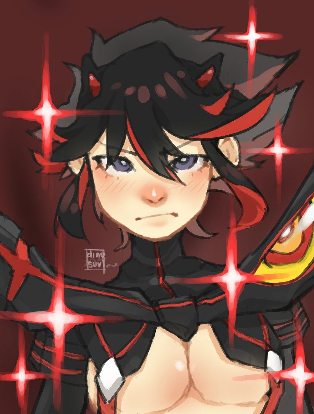
Ryuko Matoi from Kill la Kill
Sharing my artwork, any suggestion Or criticism?Dec 1, 2020#ryukomatoi
#killlakill
Comments
I feel like it's mostly a layout thing that makes this feel off, there's just one too many sparkles here and shrinking all of them just by a hair could help with how cluttered it feels. In contrast, since their hair is short and their clothes/ armor doesn't have too much shape until at the shoulders, the neck space is very empty. Either moving a sparkle up more or thickening the neck could help immensely. Now this part is just nit picking because I don't see many things to work on with this piece, but, the lines on the chest feel a little rough compared to the face giving it a different texture. Almost like it's a shirt instead of their skin, smoothing that up could help. Other than that I think this peice is pretty appealing, and you did a great job on it!

•
•

I really like it! As other people already said, the tiddies look kinda weird, they should be a little lower maybe, but it's good!
•
•oooo i love how this looks
 i think the chest area looks a little too tilted in comparison to the head but other than that i love it!
 i think the chest area looks a little too tilted in comparison to the head but other than that i love it!
•
•Aaaah, the ultimate badass girl ~ for critique I can say :
- her right breast should should be on top of the left if you follow the volume you made on her collar and globally the whole breast part should be a little lower
- like the other one said, you should try to work more on the impact of lights on her breasts and add shadows under them
-he right shoulder (on the left) should be upper
If you have any question, feel free to dm me, I even can take time to make a doodles to explain :')
Anyway good work, she's really cool

- her right breast should should be on top of the left if you follow the volume you made on her collar and globally the whole breast part should be a little lower
- like the other one said, you should try to work more on the impact of lights on her breasts and add shadows under them
-he right shoulder (on the left) should be upper
If you have any question, feel free to dm me, I even can take time to make a doodles to explain :')
Anyway good work, she's really cool
•
•The breast currently look like male pecs. More shadow underneath them would make them look more round at least 

•
•