
 ✿ First year animation student
Advice on colour
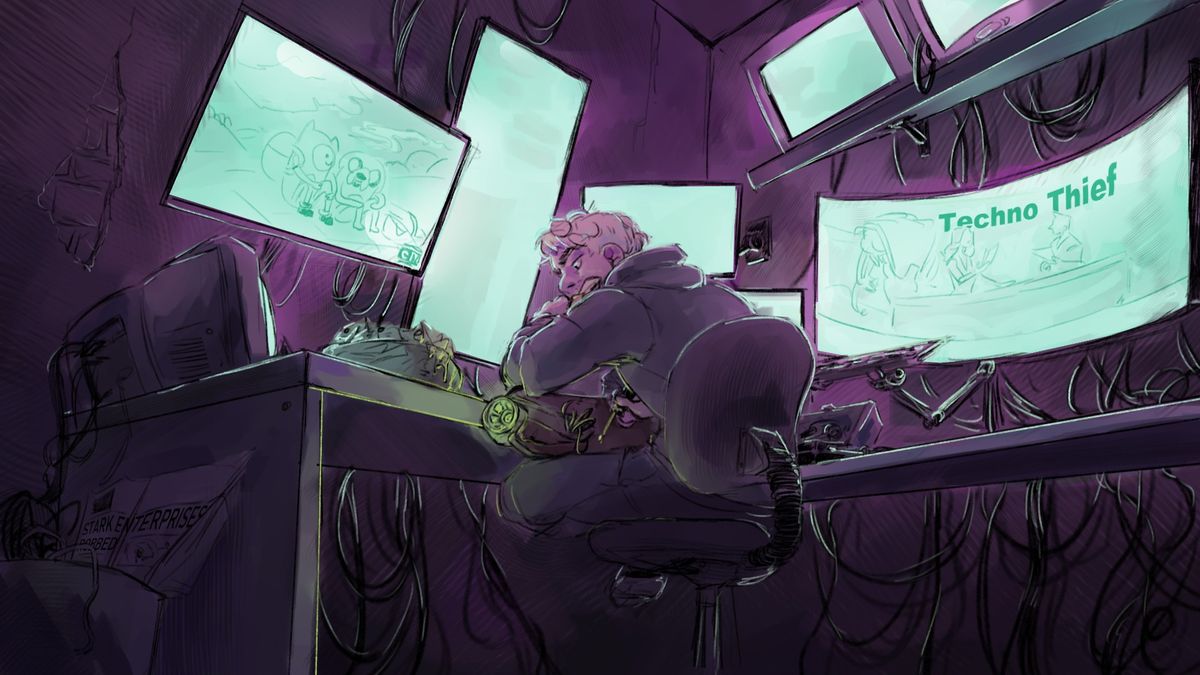
Hey people on Artfol!! This is my first post so I don't really know what to expect (๑•﹏•)Anyways! This is a piece I did a while ago for a classmate. Which motivated me to finish the piece all the way through! And since I don't get around to colouring my work often, I wanted to ask your advice on my current use of colour.
I usually struggle with finding colours that work well together, but when I do my work looks pretty bland and doesn't have a lot of contrast. If you have any advice on improving that balance in my work I would greatly appreciate it!
If you have advice on anything else in this piece feel free to tell me!Mar 23, 2021
Comments
The colour selection looks great here! The green creates "arrows" that point toward the center point and I find it quite satisfying! What I think you could improve on is the lighting coming from the monitors. The monitors look like it's glowing from the edges and makes it look like papers on top of LED lights. How you can fix this is observe how a flashlight shines light in a dark room and analyze how the light works with its surroundings. I hope you found this advice useful towards you in the future 

•
•