
Anthro exercise
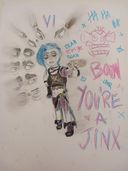
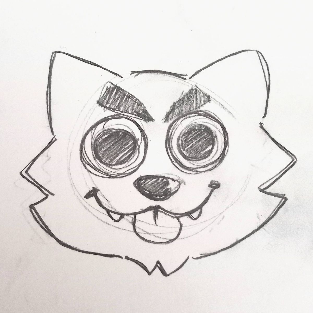
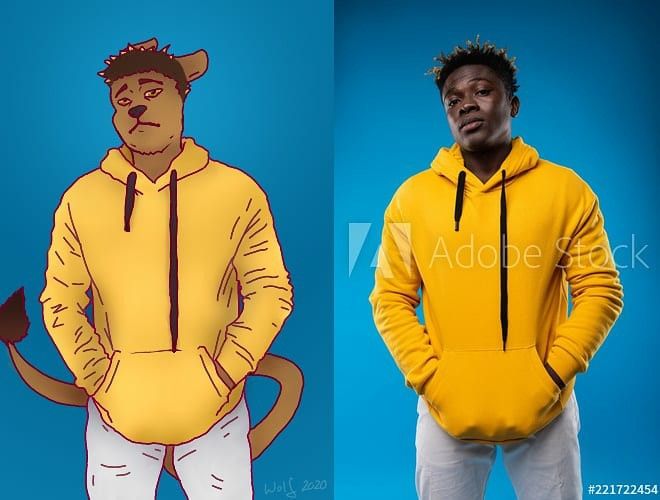
I drew this on pain tool sai 2 and I was wondering how I can improve the portrait that I transformed into an anthropomorphic character.Let me know what you guys think :>Jan 8, 2021
#portrait
#digitalart
#artexercise
Comments
@ariki_artxotherworld Ah thank you so much for your critique! I see what you mean, I'll try to do that next time. I haven't managed to figure out yet with how to use highlights and shadows correctly and yes please! I would greatly appreciate it :D
•
•The piece is great, I can easily recognise the character and it can be a good exercices
Also, I see you did a lot of folds and wrinkles in the sweat and all
The problem is, because of how you did the shadow, it doesn't look as good as it could be
It lacks shadows.
Take a look at the reference for exemple
Each fold has a little shadow, in a certain place, but we can clearly see them
There are also highlights, on some of the folds where the color is a bit lighter, and on the side of the arms and legs
The fact is, there is more in the shadows than just some lighter grey under the arms
You would need to apply stronger shadows so we can see the contrast, and with that contrast we can get an idea of the light source
Here, you used grey for your shadows
It's not necessarly a bad thing, but it's not advised in general
On the photo, if you pick the colors with pipette tool ( dunno how it's called sorry ^^`), you would end up with a light earth brown, a more red-ish brown, and mustard yellow, and probably more nuances, as well as a very light blue for the highlights at the extremes lines of the arms
Next time you do this exercices, try to add stronger shadows with nuances of the base color instead of greay, and do the shadows and highlights of all the folds
It will add more depth to the drawing
All I said here is a bit technical, but i hope it can help you improve
Don't hesitate to search for tutorials
I can link you some i found in Instagram if you want ^^

Also, I see you did a lot of folds and wrinkles in the sweat and all
The problem is, because of how you did the shadow, it doesn't look as good as it could be
It lacks shadows.
Take a look at the reference for exemple
Each fold has a little shadow, in a certain place, but we can clearly see them
There are also highlights, on some of the folds where the color is a bit lighter, and on the side of the arms and legs
The fact is, there is more in the shadows than just some lighter grey under the arms
You would need to apply stronger shadows so we can see the contrast, and with that contrast we can get an idea of the light source
Here, you used grey for your shadows
It's not necessarly a bad thing, but it's not advised in general
On the photo, if you pick the colors with pipette tool ( dunno how it's called sorry ^^`), you would end up with a light earth brown, a more red-ish brown, and mustard yellow, and probably more nuances, as well as a very light blue for the highlights at the extremes lines of the arms
Next time you do this exercices, try to add stronger shadows with nuances of the base color instead of greay, and do the shadows and highlights of all the folds
It will add more depth to the drawing
All I said here is a bit technical, but i hope it can help you improve
Don't hesitate to search for tutorials
I can link you some i found in Instagram if you want ^^
•