


Archways
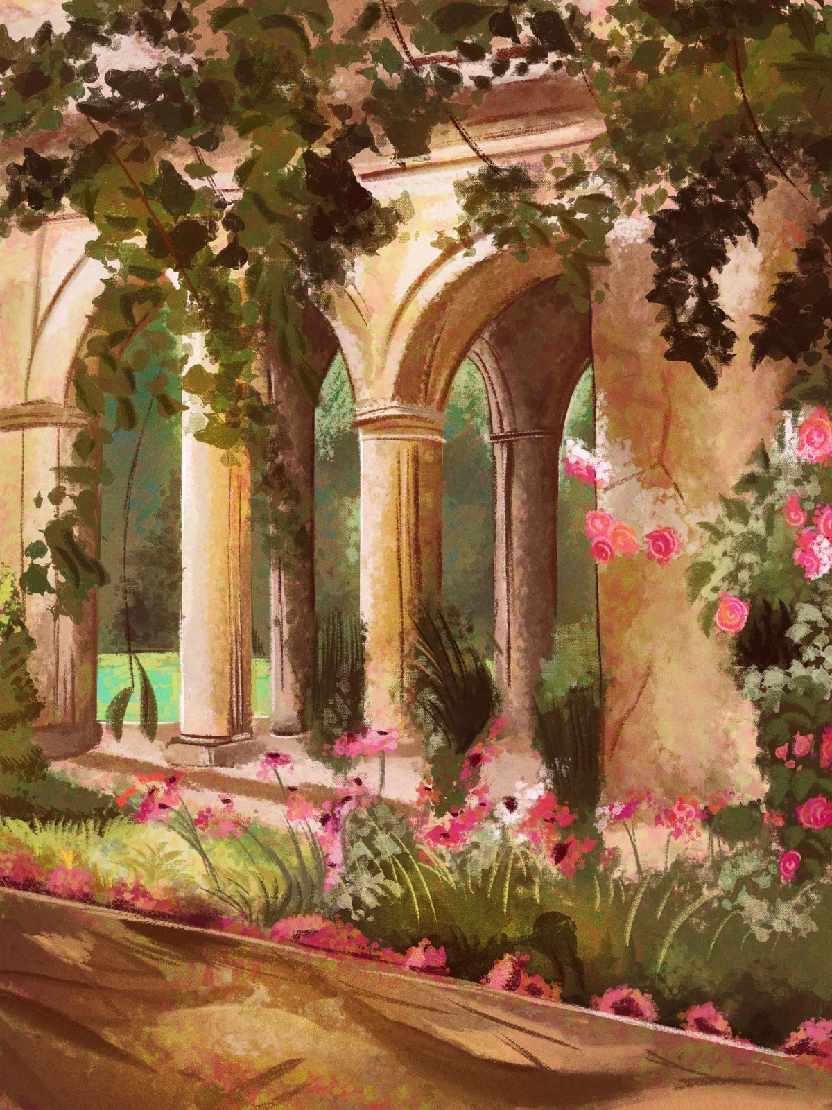
Another background painting!! This one in a new style- a style which i like way more, its more efficient and I believe more visually interesting. I’m very proud of this, however I am still new to background painting so advice and criticism is much appreciated :)Jan 6, 2022Comments
hello! i really love this piece!!
one thing I suggest is that you look at perspective grids or lay down vanishing points when mapping out landscapes like this. they can help with what surfaces light and shadow will affect and what surfaces the human eye will see.
(ex. perspective is a bit inconsistent where the column bases on the left don't line up with the floor of the structure, which seems to be drawn with perspective)
adding onto that point, you could also look up architectural references like greek and roman columns for some more detail, if you'd like :)
one thing i'm a bit confused with is your use of shape and form. where the wall meets the arch on the right side is a bit confusing to me because they seem to blend together into one block of color. maybe you could carve out the wall to make the arch clear, or add some shading to differentiate the wall from the arch and make it appear like they're on 2 different levels of depth.
another area is with the pillars in general, especially on the left with the leaves covering the arch. i cannot tell if one is in front or in back, or if they're both on the same level of depth because they generally have the same height
other than that, i really love the colors and the different textures in this piece!
i hope this helps!

one thing I suggest is that you look at perspective grids or lay down vanishing points when mapping out landscapes like this. they can help with what surfaces light and shadow will affect and what surfaces the human eye will see.
(ex. perspective is a bit inconsistent where the column bases on the left don't line up with the floor of the structure, which seems to be drawn with perspective)
adding onto that point, you could also look up architectural references like greek and roman columns for some more detail, if you'd like :)
one thing i'm a bit confused with is your use of shape and form. where the wall meets the arch on the right side is a bit confusing to me because they seem to blend together into one block of color. maybe you could carve out the wall to make the arch clear, or add some shading to differentiate the wall from the arch and make it appear like they're on 2 different levels of depth.
another area is with the pillars in general, especially on the left with the leaves covering the arch. i cannot tell if one is in front or in back, or if they're both on the same level of depth because they generally have the same height
other than that, i really love the colors and the different textures in this piece!
i hope this helps!
•
•