@vacant_saturationx89's post on Artfol




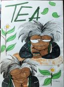
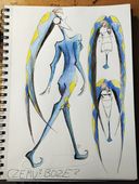
Do any traditional artists on here know how to make the colours on your drawing not suck? Especially in drawings that have certain settings and backgrounds that are more detailed and things similar. Or any good online tutorials or anything of the sort.Nov 22, 2024
#help
#question
Comments
Oh, colour is so complex! Based on what I understood until now, this is my advice.
- Use less colours. You don't need to use the real colours of object, you can use unrealistic colours. In the real world colours change a lot depending on the light conditions, so humans are used to recognise objects even with unrealistic colours. The only thing that must stay stable is value (what parts are lighter or darker), because humans use it to recognise objects and volumes. So, you can decide in advance to use just 3-4 colours that look nice together, and use them to colour everything in your drawing even if it's not realistic.
- You can start by colouring everything with one base colour (not too dark), and then go over each object with different colours. This way, every object will have a slightly different shade of the same base colour. Which means that they look a bit different, but they are still similar enough to stay in harmony with each other. This works because colours are relative: you percieve them based on their relation with other colours. So if you have a blue that contains a bit of green, and a blue that contains a bit of red, next to each other (or on a blue background) you see them as green and red.
- Often the cause of bad colour combination is brightness. If you have pure hues (colours at the edge of the colour wheel: a red very red, a yellow very yellow, a green very green, etc.), they are like very muscled people each pulling a blanket in their own direction very strongly, so the blanket breaks (it is a metaphor for colour harmony). If they have the same base colour, the pull in a similar direction without breaking the harmony. Or you can make them less muscled by mixing them with white/black/grey, which are hue-less ("muscle-less") colours. So the resulting greysh colours will pull the harmony more gently without breaking it. You can keep some pure hues but not too many.
- Try and experiment. It's very complex, don't get discouraged, it takes time.

- Use less colours. You don't need to use the real colours of object, you can use unrealistic colours. In the real world colours change a lot depending on the light conditions, so humans are used to recognise objects even with unrealistic colours. The only thing that must stay stable is value (what parts are lighter or darker), because humans use it to recognise objects and volumes. So, you can decide in advance to use just 3-4 colours that look nice together, and use them to colour everything in your drawing even if it's not realistic.
- You can start by colouring everything with one base colour (not too dark), and then go over each object with different colours. This way, every object will have a slightly different shade of the same base colour. Which means that they look a bit different, but they are still similar enough to stay in harmony with each other. This works because colours are relative: you percieve them based on their relation with other colours. So if you have a blue that contains a bit of green, and a blue that contains a bit of red, next to each other (or on a blue background) you see them as green and red.
- Often the cause of bad colour combination is brightness. If you have pure hues (colours at the edge of the colour wheel: a red very red, a yellow very yellow, a green very green, etc.), they are like very muscled people each pulling a blanket in their own direction very strongly, so the blanket breaks (it is a metaphor for colour harmony). If they have the same base colour, the pull in a similar direction without breaking the harmony. Or you can make them less muscled by mixing them with white/black/grey, which are hue-less ("muscle-less") colours. So the resulting greysh colours will pull the harmony more gently without breaking it. You can keep some pure hues but not too many.
- Try and experiment. It's very complex, don't get discouraged, it takes time.
•
•What do you mean? Do you mean colour theory, or taking a photo or scan of your work and making it look true to life?

•
•