
 Yummy cuties and bodies lover
 OC series”Chaos and Cosmos”

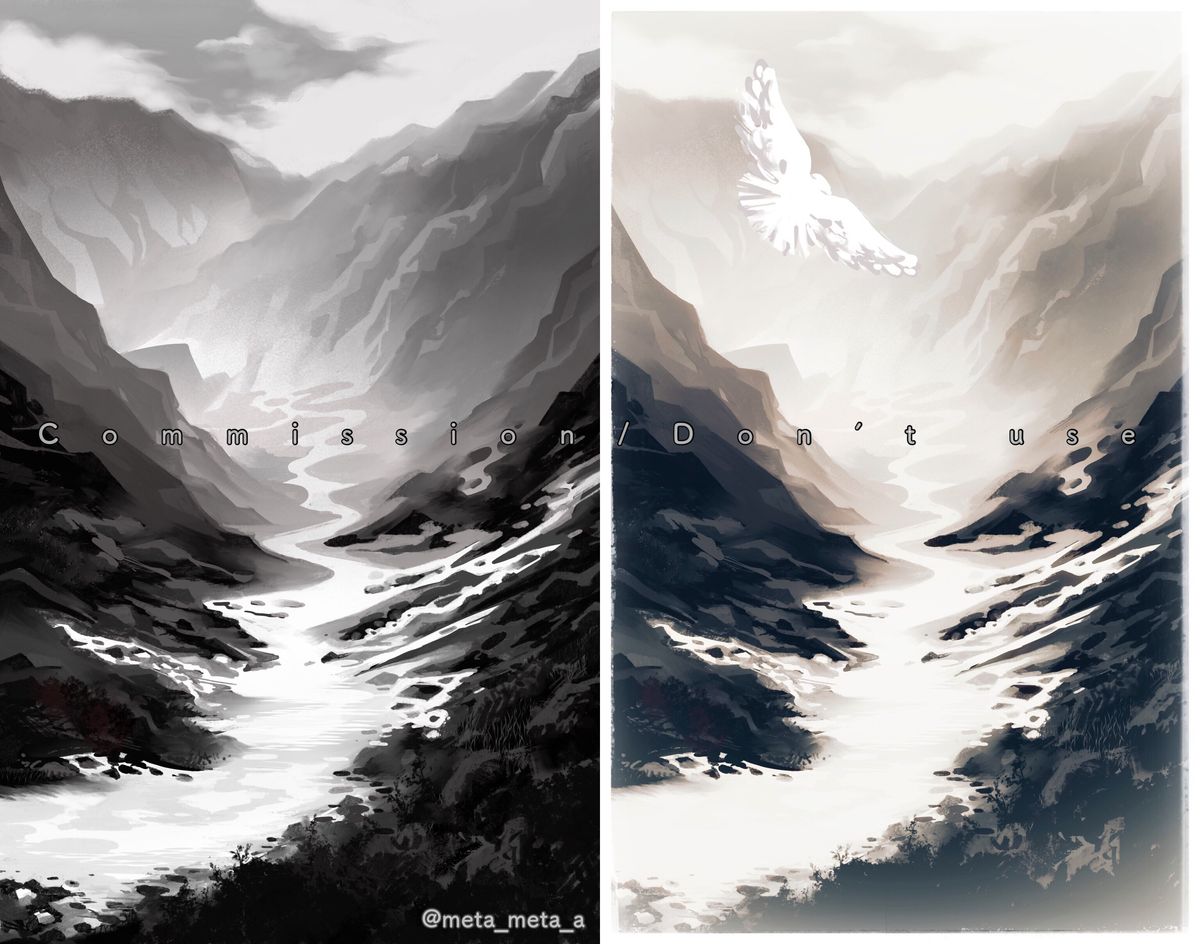
Ganges Liver landscape
It’s one of comm works for an essay,monochrome Ganges Liver images.
I rarely draw huge landscapes so it was my trial
representing sumi-like oriental moody digitally.
There are two versions,
clear lines and smoky with a bird.
Which do you prefer and tell me the reason

(Btw I didn’t know after all which one the client will use
 )Jun 13, 2021
#landscape
#procreate
#commision
Comments



Wow I don’t know if I could pick a favourite. Both are amazing. I do like the one with the bird though because it gives an extra element that you don’t look at first but then go “ooo look!”

•
•I prefer the one on the left bc it is simpler, and the bird in the second one makes me unsure of the scale of the mountains (though I do like the faded/misty/foggy look of the farground and lower edge of the right composition.) The only thing that bothers me about either composition- and it’s so minor that I feel like an idiot even bringing it up- that one small hill is a bit distractingly simplified. The hill I mean is the second hill above the first “m” in the “commission” text. Every other surface in the piece seems to be either intentionally simpler or full of shaded detail, but that one peak is just flat, in my nitpicking opinion  The composition is awesome and your choice of whether to paint in a crisp or smudgy line/brush encourages the viewer to explore each little detail.
  Great work overall
 The composition is awesome and your choice of whether to paint in a crisp or smudgy line/brush encourages the viewer to explore each little detail. Great work overall
•
•I prefer the one on the right with the bird and brown tones
It's much more eye catching, interesting, and lively(? Idk how to describe it lol)

It's much more eye catching, interesting, and lively(? Idk how to describe it lol)
•
•They're both stunning but I prefer the one on the right, it has more of a mysterious atmosphere to it 

•
•both look beautiful but I love the first one because it’s so moody. the bird makes the other one look just the tiniest bit like a cliche postcard imo

•
•


In your stories I chose the first one, but now I feel maybe the second one works better if it there's hope in tomorrow (not sure how to express it but the second one feels like heroes will prevail and shadows will be cast away)
 but the second one feels like heroes will prevail and shadows will be cast away)
•
•I like the one on the right, it has a subject to draw the eye to and gives a little more of a story with the image, definitely has a nice mood to it too ︎
︎
 ︎
︎•
•I prefer the left side. I feel the right side has to much going on between the mist and the bird in the background. The left side is has a perfect amount of things going on and doesn't make the background look overwhelming. But they both are still beautiful and breathtaking drawings!

•
•They both look so good ~ the first one has a quiet contemplative style while the one with the bird seems to be filled with a bit more lightness and hope :)))

•
•I like both- but would prefer the 2nd one without the bird I feel like it distracts too much from the background. Maybe if the bird was smaller but it feels too big for where it is places in the composition
 I feel like it distracts too much from the background. Maybe if the bird was smaller but it feels too big for where it is places in the composition
•
•They both look breathtaking, it's almost difficult to pick. The first one has more mystery into it. The second image feel more ethereal. However, I'd go with the second because it fits perfectly with the landscape and the bird gives it more life into it.

•
•Left one for sure! There is so much nice contrasts and a good focal direction in the piece.

•
•I prefer the left one, but I think applying the same heavy mist around the sky/cloud area as in the sepia would blend the feeling you might be going for? It looks great
 It looks great
•
•I think I love clear lines more (sorry birdie uwu) ! The overall vibe is more appealing to me I guess and I love how it feels like I'm there 


•
•The right side has a much hazier and subtle atmospheric perspective, much like traditional ink washes. Myself I prefer a stronger contrast like the left, which reads very clear, but the way you play with temperature in the sepia of the right is very compelling. The warmth fades as the perspective comes closer to the viewer in the right, like a sunrise beginning, which tells a very good visual story. Other than that, I believe steph_art also gives really compelling advice I also agree with. Its a very lovely and dreamy piece!

•
•Beautiful. I think I preffer the left one. It is darker and more empty. Feels a bit like a black metal album cover. I'm really into stuff like that

•
•I love the softness of the one on the right, the use of colour and the mist further back gives a stronger sense of atmosphere. But as previous people have mentioned I agree that the bird doesn't sit right with the piece. Could possibly try a flock of birds but make them a lot smaller as I feel my eye is only drawn to the bird. Whereas the left one has a stronger contrast but my eyes flow nicely around the entire piece as it doesn't have anything breaking up the space, as the composition is strong

•
•I like the one on the left. The sepia on the right looks nice, but the bird kind of gets lost against the sky.

•
•I really like the slight saturation in the piece to the right but the stronger contrast in the one to the left looks really cool too!

•
•For me, the one on the right. The color shift between black and the sepia color works super well together. A nice atmosphere to the piece.
A really good sense of depth with the dark foreground, middle ground a light sepia and fading into the distance background. Your rule of thirds is working very nicely as well with the suggestion of a bird, then detailed dark land scape bellow following the soft brown background. The edges fellow more varied in the one of the left as well. Very nice work and I really enjoy both pieces. Great work and thank you for sharing.

A really good sense of depth with the dark foreground, middle ground a light sepia and fading into the distance background. Your rule of thirds is working very nicely as well with the suggestion of a bird, then detailed dark land scape bellow following the soft brown background. The edges fellow more varied in the one of the left as well. Very nice work and I really enjoy both pieces. Great work and thank you for sharing.
•
•I think the left one definitely catches the eye more because of the darker colors and with the additional details. I do like your owl though it gives perspective but also the scale of how big the mountains are, maybe the left could have one too

•
•These are so beautiful!! 
 I really like the subtle colours and mist in the right one, but I feel the same with the other person's comment that the bird kind of breaks the pathway. Maybe if you move it somewhere? I also feel like the white on the bird is too cool toned when the background has a warmer tone!
 I really like the subtle colours and mist in the right one, but I feel the same with the other person's comment that the bird kind of breaks the pathway. Maybe if you move it somewhere? I also feel like the white on the bird is too cool toned when the background has a warmer tone!
•
•Imo I definitely like the left one more mostly because of the lack of the bird (the bird kinda breaks the eye pathway, isn’t very clear due to color contrast and tbh is quite big considering it’s probably farther away)
I also really like the dark, contrasted mood it has but the right has a calmer mood with the colors and softer blacks, both work respectively depending on the mood you want
But overall looks amazing! Really making me wanna do landscape studies as well

I also really like the dark, contrasted mood it has but the right has a calmer mood with the colors and softer blacks, both work respectively depending on the mood you want
But overall looks amazing! Really making me wanna do landscape studies as well
•
•