

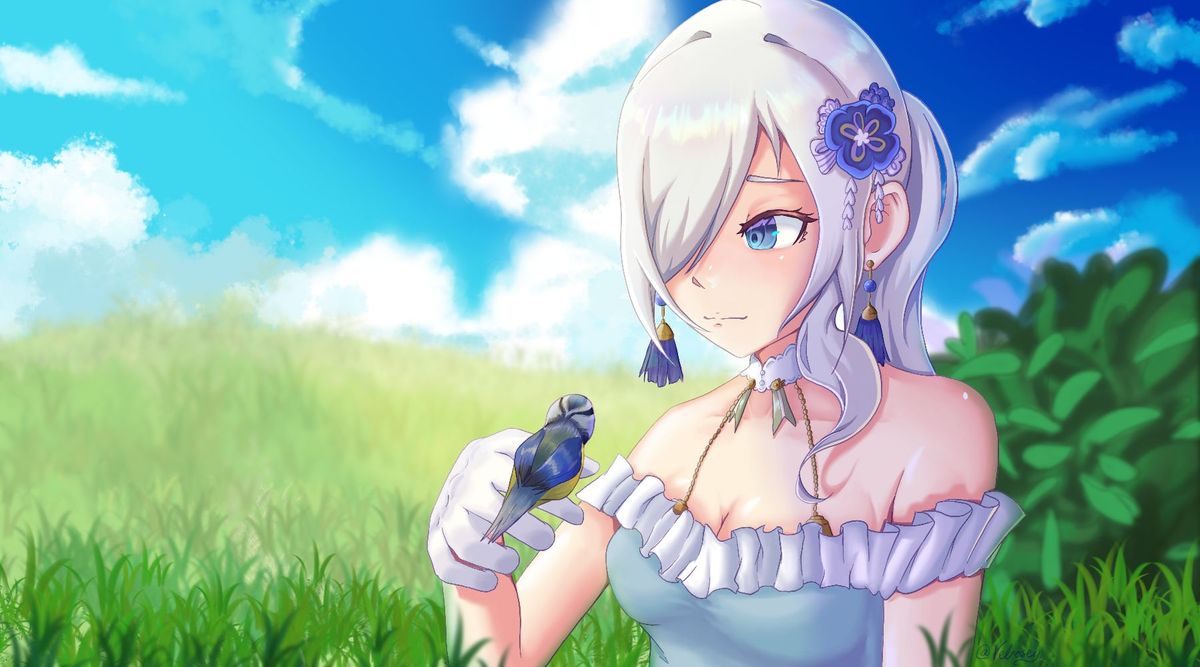
Alice in the Fields
I'd just like to know if anybody thinks I could have improved this in some way or done something different so I can keep it in mind for future reference <33May 30, 2021Comments
The bg and character are beautiful, however they don't read that well together.
Your character is in the foreground with grass surrounding her, however because of the way you've done the grass, it looks like she only has half a body's sitting on top of the grass.
While they're rendered beautifully (I can't stress enough just how beautiful I find the rendering on their hair) the lighting on her doesn't seem to fit where she is. She's rendered on the cooler side, while the environment around them is quite saturated. A cooler bg with similar colors to the ones you used on Alice would make it a little more cohesive.
Hope this helps!

Your character is in the foreground with grass surrounding her, however because of the way you've done the grass, it looks like she only has half a body's sitting on top of the grass.
While they're rendered beautifully (I can't stress enough just how beautiful I find the rendering on their hair) the lighting on her doesn't seem to fit where she is. She's rendered on the cooler side, while the environment around them is quite saturated. A cooler bg with similar colors to the ones you used on Alice would make it a little more cohesive.
Hope this helps!
•
•