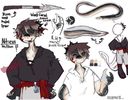
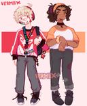
@vermiix's post on Artfol



 || They/Electric
  sharks
Any tips for lights and shadows ? Also any website with good references for poses ?Nov 26, 2021
#question
#shading
#illustration
#characterart
#q
Comments
Lights are not white, white should be reserved for high contrast stuff. Same with black. Try using different colors. You can get ideas by color picking your favorite art.

•
For shading,when i do it,i put like a darker version of a color that isnt the same color,like using fluo pink for shading yellow!

•
If you’re struggling with light and shadows, look for value studies.
Take a picture and turn it to greyscale, identify where the light is coming from in the image.
Start with simple shapes (sphere, cube, prisms) and practice identifying how the values look on that object.
Use a lamp or light and move it around an object of your choice to see how the shadows/lights change on that object
When approaching values for your artwork, decide where the light source is. Is it coming from behind the object? Above? To the left? If there’s more than one light source, which one is more dominant?

Take a picture and turn it to greyscale, identify where the light is coming from in the image.
Start with simple shapes (sphere, cube, prisms) and practice identifying how the values look on that object.
Use a lamp or light and move it around an object of your choice to see how the shadows/lights change on that object
When approaching values for your artwork, decide where the light source is. Is it coming from behind the object? Above? To the left? If there’s more than one light source, which one is more dominant?
•
For understanding how light hits the character/place, drawing a lil sun and arrows helps,
For actual shading, 1 method would be on a new layer, set it as multiply/divide/burn/etc, then draw lines as the border of the shadow and light and then filling the blank space.
Hope this is of help

For actual shading, 1 method would be on a new layer, set it as multiply/divide/burn/etc, then draw lines as the border of the shadow and light and then filling the blank space.
Hope this is of help
•
Depends on your style, but something I’ve found to help is to use opposing colors for lights and shadows. So if you have blue/cool tone light, use red/warm tones for the shading.
Also sometimes putting your piece in gray and just shading over it helps you focus on the shadows instead of the colors of everything

Also sometimes putting your piece in gray and just shading over it helps you focus on the shadows instead of the colors of everything
•
•
I think adorka stock on DeviantArt has pose references. I see a ton of references on Pinterest are linked to DeviantArt.
As for lighting and shadows, you can always study movie stills. The basics are
warm light source (ex yellow) = cool shadows (ex blue).
And cool light source = warm shadows.
I personally struggle with cool light sources and hue shifting so it's probably better I suggest you look up Marco Bucci on YouTube for tips on light and shadow.

As for lighting and shadows, you can always study movie stills. The basics are
warm light source (ex yellow) = cool shadows (ex blue).
And cool light source = warm shadows.
I personally struggle with cool light sources and hue shifting so it's probably better I suggest you look up Marco Bucci on YouTube for tips on light and shadow.
•