 | digital artist and animator
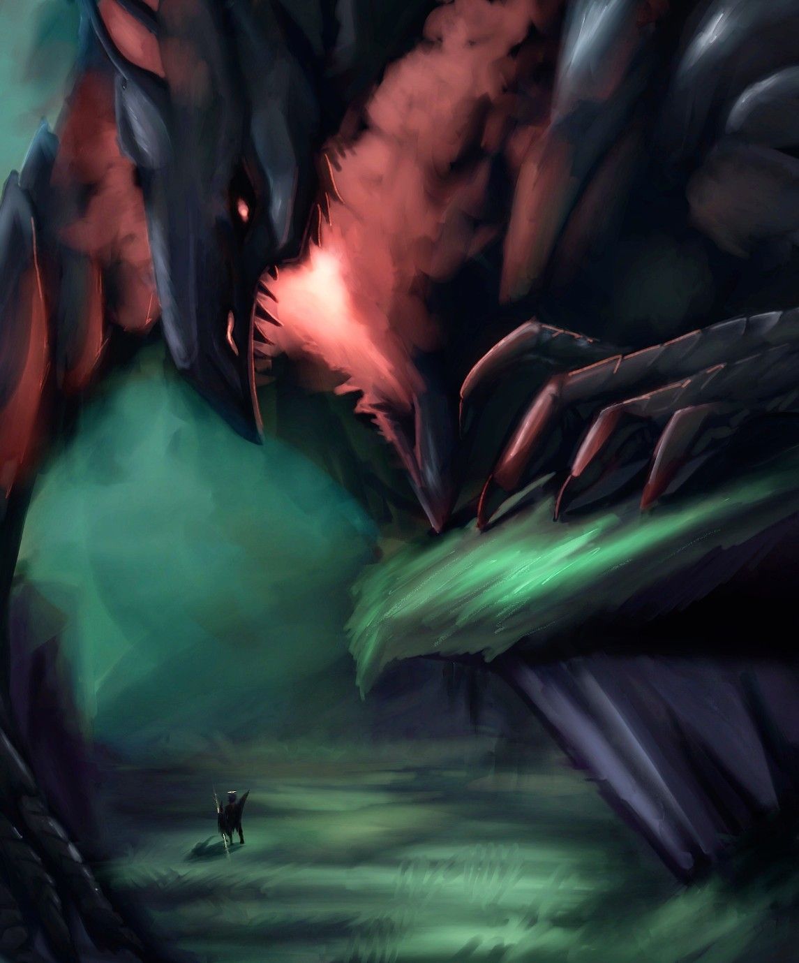
Something big is comin'
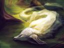
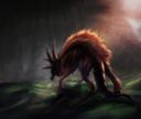
Hello there!With my recent pic, I'm looking for critique on how to make things appear really big and menacing! Right now, I feel like my painting looks rather flat and uninteresting, I would really appreciate feedback on that!Apr 11, 2021
Comments
I think the composition is good very dynamic and the use of contrasting colors creates a flow through the work. I think perhaps the reason it feels flat to you might be because your main colors (being that red and green) are both pretty similarly saturated. I think upping the saturation on one would improve the contrast and make things appear less “flat” plus while having the clear cut between the colors looks fine. colors generally are influenced by their surrounding applying that reddish hue to certain areas of the environment might also help. Either way I love this the monster looks so cool. I love all the texture going on.

•
Maybe make the green less saturated or darker and the red more vibrant/saturated? I'm no expert at art but contrast between colours and lightness/darkness can change a lot. Looking at gray-scale version of the drawing can help. ( The drawing is amazing by the way! I love the way you paint)

•
Maybe make the red slightly brighter? And more lighting on the claws, if possible? so you can see just how sharp they are. The proportions and design of the monster itself are gorgeous tho

•