




 | CURRENTLY ADDING ALL MY NEW ARTWORK SLOWLY. BEAR WITH ME

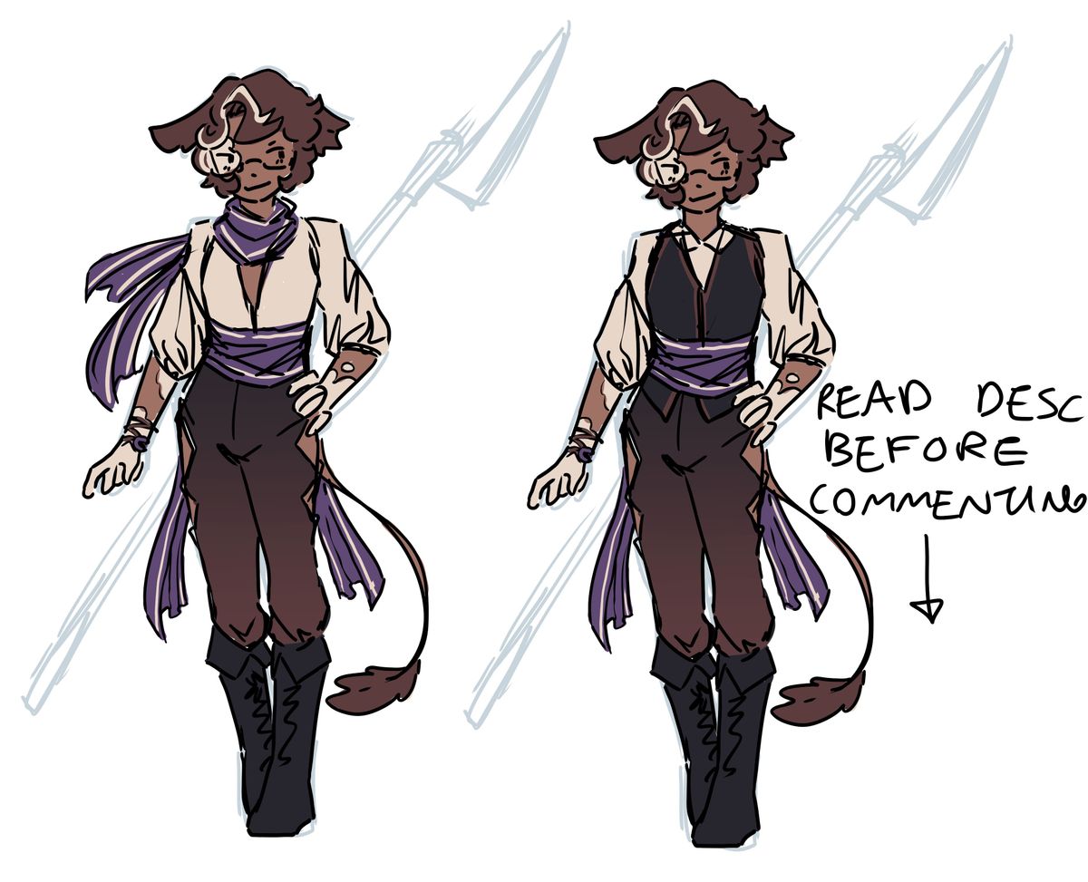
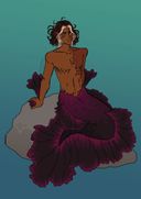
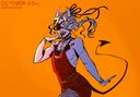
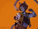
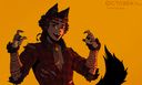
[oc] Axle Design Drafts 2
I went for design 1 last time because it suited him better, HOWEVER, I was drawing axle before realising I was stumped with a new idea so I'd like more help.Axle takes pride in his appearance and prefers not to look sloppy. He likes looking elegant.
His favourite colour is purple.
He's a mage too so I'd like that to come across.
1 or 2?
Any reason why?
Any changes to one of the designs, or aspects I could combine to make a stronger design?
Thanks for ur time!
This post is hidden from my gallery but can be accessed from the Brunnera collection on my account.Oct 24, 2021
#brunneraproject
#brunnera
#oc
#design
Comments
Number 2 the vest breaks up the colours well and having only one purple bit draws more attention to it

•
2 is the best cause the scarf on the neck and the waist makes the design a little cluttered. 2 also allows the dark shirt to pop more against the other colors
•
•
2 definitely, its definitely a great match of colors and the dark "shirt" make the other colors pop more. It perfectly matches the look of elegance...Gives off a "going to a shmancy party" vibe.. but it also looks like a casual outfit

•
•Ok so- I love the vest but also just… the deep v neck vibes of 1 are great too- also the scarf, gotta have the scarf

•
•I love both the scarf and the vest so I really can’t choose 
(Actually if a combination of the two is too much, I prefer 1 so nvm)

(Actually if a combination of the two is too much, I prefer 1 so nvm)
•
•I like the one on right the best e-cards I feel like it utalizes all the colors really well and the scarf doesn’t feel overdone

•
•I personally find the left one better cuz it’s more flowy and light? Right gives more uniform vibes

•
•