 ︎ INFP
  SFW/NSFW Commisssions: 1 pony slot open
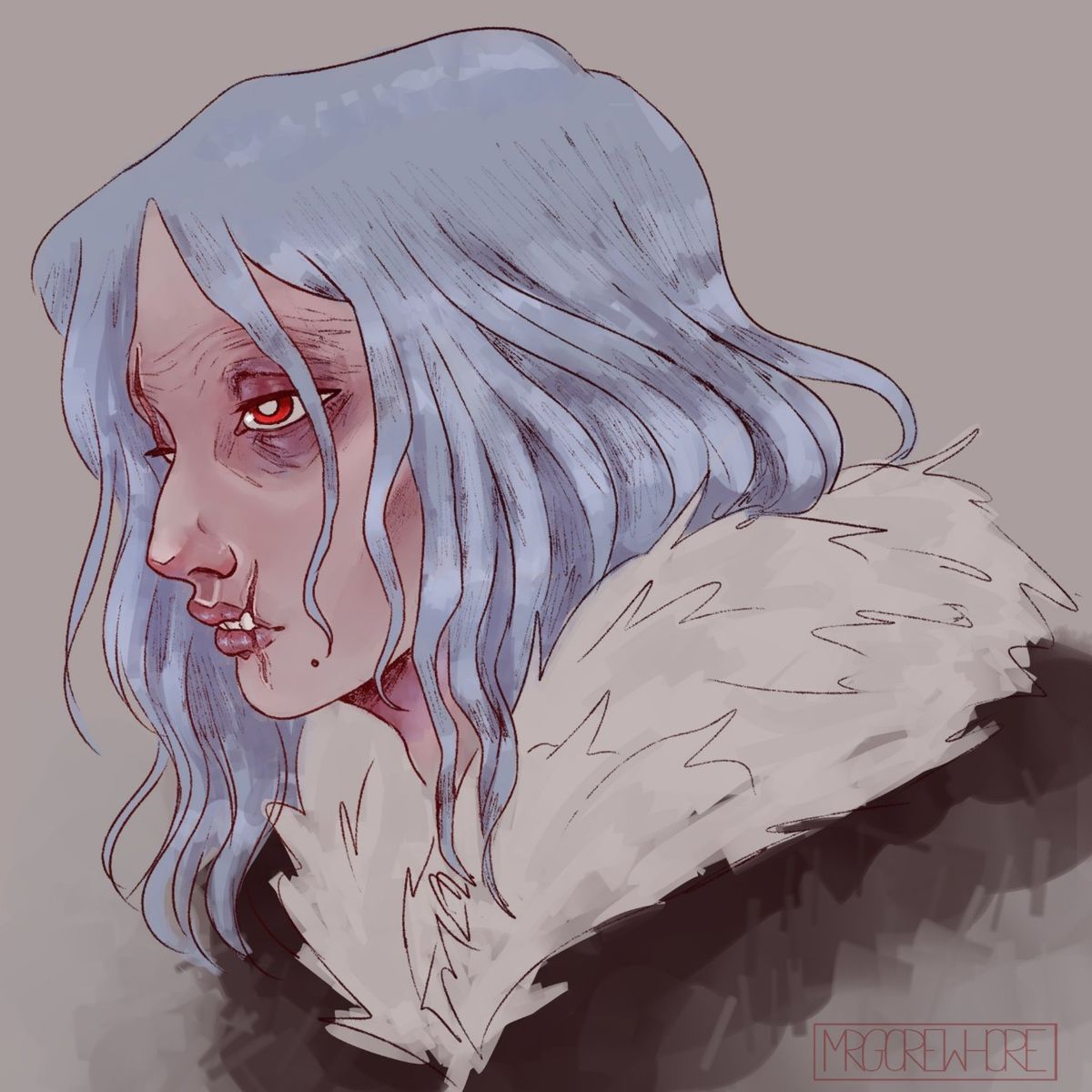
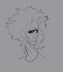
Shigaraki Tomura
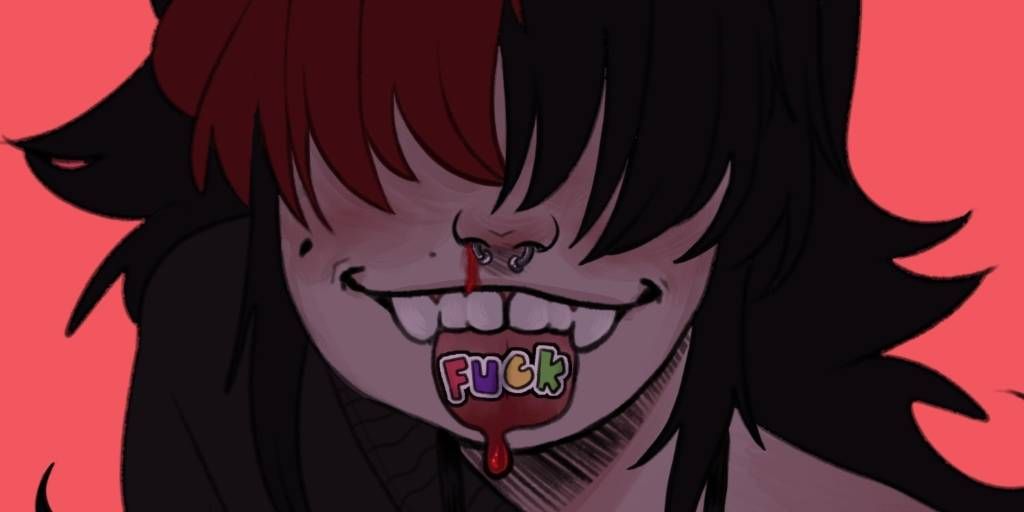
i feel as if theres something off with this? i think its the colors I chose? let me know what i can do to improveJan 4, 2021#shigarakitomura
#anime
#mha
Comments
I think this is looking great!! If you're concerned about the colors, maybe try adding some color variation in the shadows/highlights? (e.g. A slightly colder hue in the shadows)
While the shading on the forms looks great, it might pay to do a bit more shading for the cast shadows and ambient occlusion - eg the neck area should be darker because it's hidden more by the chin/hair/clothes, but it currently looks like it's receiving about as much ambient lighting as everything else. Same goes for anything that's kind of tucked away in nooks and crannies. This kind of thing is generally more of a style/personal preference though imo, I actually really like the coloring as it is now!

While the shading on the forms looks great, it might pay to do a bit more shading for the cast shadows and ambient occlusion - eg the neck area should be darker because it's hidden more by the chin/hair/clothes, but it currently looks like it's receiving about as much ambient lighting as everything else. Same goes for anything that's kind of tucked away in nooks and crannies. This kind of thing is generally more of a style/personal preference though imo, I actually really like the coloring as it is now!
•
Hey there, so first off, the eyes are a little high for the face shape, and the ear should be ever so slightly visible based off the hair shape. For the hair, make sure to not use lines with the same width between, makes the hair look very stiff (compare your left side to right, you’ll get what I mean). For colors, a simple layer of a red soft light could really bring more life to the piece (unless you want them to look dead, maybe some blue?)

•
•
More from this artist