
Roots
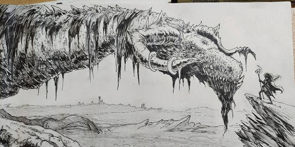
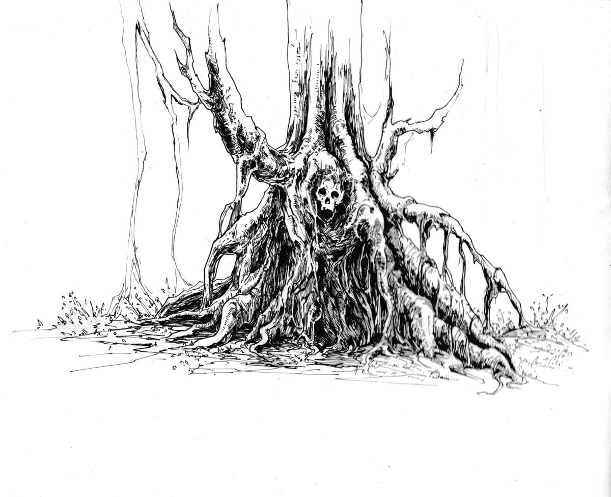
Hello everyone, this is my first post here.This is a pen and ink sketch I made a while back while having a bad day. I would love any suggestions as to where I can improve. Anything is helpful. Thanks in advance!Apr 28, 2021Comments

This looks amazing!! I’m astonished at all the tiny details ahh! I love the contrast between the where the light and shadows hit, it really makes the whole picture stick out and it catches the viewers attention in such a great way.

•
It overall looks really good, you have a fantastic style, and a really talented inker by the way. The only suggestion I think I can make is to make the outline of the whole tree thicker, leaving every line “inside” the piece on the normal thickness. Plus a bit more of little white spaces could please the eye when you look at the center (where his chest and rest of body should be)

•
•
You style really seems to be developed good  I once learned to put stronger outlines and around things that located perspectively more in front but personally I think in this case it would ruin the unique look
 I once learned to put stronger outlines and around things that located perspectively more in front but personally I think in this case it would ruin the unique look
 •
I love the difference between the in focus skull and the more loose out of focus stuff at the edges.

•