Gore
UGH COLORING
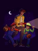
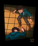
Edit: btw the gore is some zombie stuff… pretty light tho cause my knowledge of inner human anatomy isn’t that great HAHELP I suck at colors and I do not have natural intuition when it comes to color palettes. How can I organize colors so that there’s good contrast but retain a nice palette? How do I make it look like it’s night time??? In my head I imagined a nice contrast of orange torchlight with the blue night sky (also I WOULD make the moon white cause I think it’d look better but this is based on a video game event of a blood moon so I’m just gonna keep it red even if artistically it’s not the best choice
 )
)OH note that these flat colors are just like… generally what color things are in the game? But I’m willing to change it up y’know
Thank you in advance!!Feb 17, 2023
#terraria
Gore
Comments
Alright to start off- I checked out the rest of your gallery and ypu actually seem to have a nice grasp on color? Most of your works look rather pleasing to the eye so either your natural intuition is better than you think or you make your struggle look effortless, which congrats.
As for the piece, definitely tone down the saturation on the grass and trees a little bit, its so in your face it fights for attention with your characters. I struggle with colors a lot too so most of what I'm about to say I'm repeating from actual professional colorists.
A good way to make sure your characters pop from the background is to make your backround slightly less saturated than your characters. Also pay a lot of attention to values and let go of local colors.
The way it works for me lately is, do a black and white value block in. It can be rough as all heck. I usually make a little gradient sample in black and white aster that. I separate elements based on depth. Usually background midground and foreground should be enough but you can separate more or less elements the sky is the limit. I decide whats the lightest and darkest value going to be (in black a d white still) and make a gradient out of it in a little ractangle. I make sure that the most important part of the illustration has the biggest contrast in values.
Then when I get to colors i create a black layer on top of the artwork and set it to saturation. That way I can quickly turn my colors to look black and white and compare them to the value block in layer. I adjust the colors until im happy with it.
As for the night effect everything needs to be tinted blue. It doesnt have to be dark. Just blue. Maybe not sky blue more like an indigo- you get my point. The rule is that the more opposite to blue the base color is (like yellow or orange) the less saturated it becomes.
But if you dont feel like adjusting colors by hand you can use a blending mode

As for the piece, definitely tone down the saturation on the grass and trees a little bit, its so in your face it fights for attention with your characters. I struggle with colors a lot too so most of what I'm about to say I'm repeating from actual professional colorists.
A good way to make sure your characters pop from the background is to make your backround slightly less saturated than your characters. Also pay a lot of attention to values and let go of local colors.
The way it works for me lately is, do a black and white value block in. It can be rough as all heck. I usually make a little gradient sample in black and white aster that. I separate elements based on depth. Usually background midground and foreground should be enough but you can separate more or less elements the sky is the limit. I decide whats the lightest and darkest value going to be (in black a d white still) and make a gradient out of it in a little ractangle. I make sure that the most important part of the illustration has the biggest contrast in values.
Then when I get to colors i create a black layer on top of the artwork and set it to saturation. That way I can quickly turn my colors to look black and white and compare them to the value block in layer. I adjust the colors until im happy with it.
As for the night effect everything needs to be tinted blue. It doesnt have to be dark. Just blue. Maybe not sky blue more like an indigo- you get my point. The rule is that the more opposite to blue the base color is (like yellow or orange) the less saturated it becomes.
But if you dont feel like adjusting colors by hand you can use a blending mode
•
•