
february sketch pt. 2
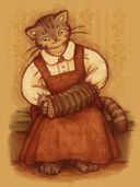
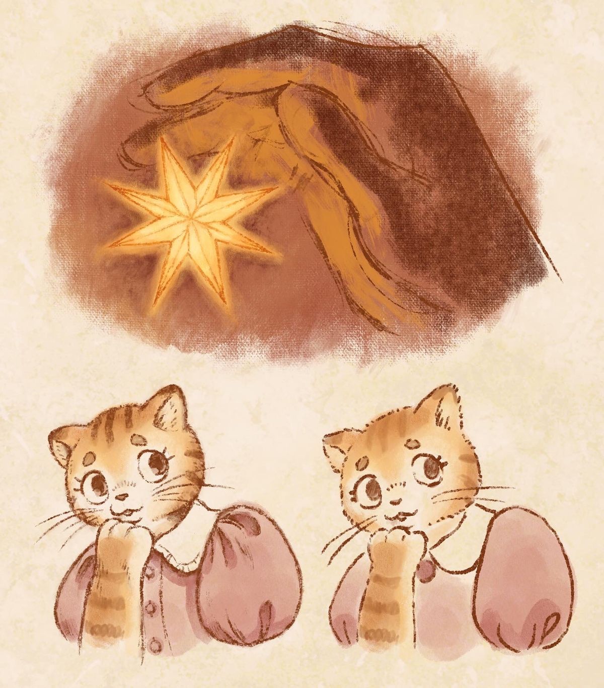
What do you think about the two different line styles of the kitties? (the top sketch is unrelated)
 —
atm, I’m leaning toward the left line style. There’s definitely charm in the ink-brushy look on the right. It lends itself to simplicity, which can be cute, but a bit limiting. With the left style, there’s greater control of small details, and I like the forgivingness of the graphite-like sketchy lines. That said, it takes a little bit more time and may risk looking a bit “overworked” compared to the right, perhaps? I’d appreciate your thoughts and opinions!
 May 17, 2022
#sketchbook
#cat
#lineart
#procreate
#style
Comments

I like the left style more, but you may want to watch out for how dark it is, since the left one is far darker then the right one

•
•

First of all, really nice drawings! I love colouring and proportions.
Everything below is just my humble opinion of a person who is new to your author's style.
And I guess left one looks more exquisite and delicate. More details catch eye and overall look more professional, neat, and charming. Gives vibes of children books' illustration. So comfy and cute. But static, and kinda conservative. The kitty looks scared or surprised in a bad way.
The right one looks sketchy and vague. But it gives more feeling of fluffiness, movement, gives vibes of indy cartoons, animations. Also I'd say it's more expressive, character's emotions look more complicated. The kitty looks surprised but also kinda intrigued and curious.
So the choice depends on where you want use it and what for.
If static illustrations - better to choose left one.
If comics, animation - I would choose the right one.
But it's all just my imho

Everything below is just my humble opinion of a person who is new to your author's style.
And I guess left one looks more exquisite and delicate. More details catch eye and overall look more professional, neat, and charming. Gives vibes of children books' illustration. So comfy and cute. But static, and kinda conservative. The kitty looks scared or surprised in a bad way.
The right one looks sketchy and vague. But it gives more feeling of fluffiness, movement, gives vibes of indy cartoons, animations. Also I'd say it's more expressive, character's emotions look more complicated. The kitty looks surprised but also kinda intrigued and curious.
So the choice depends on where you want use it and what for.
If static illustrations - better to choose left one.
If comics, animation - I would choose the right one.
But it's all just my imho
•
•