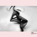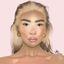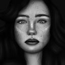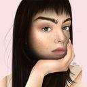
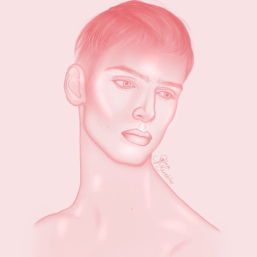

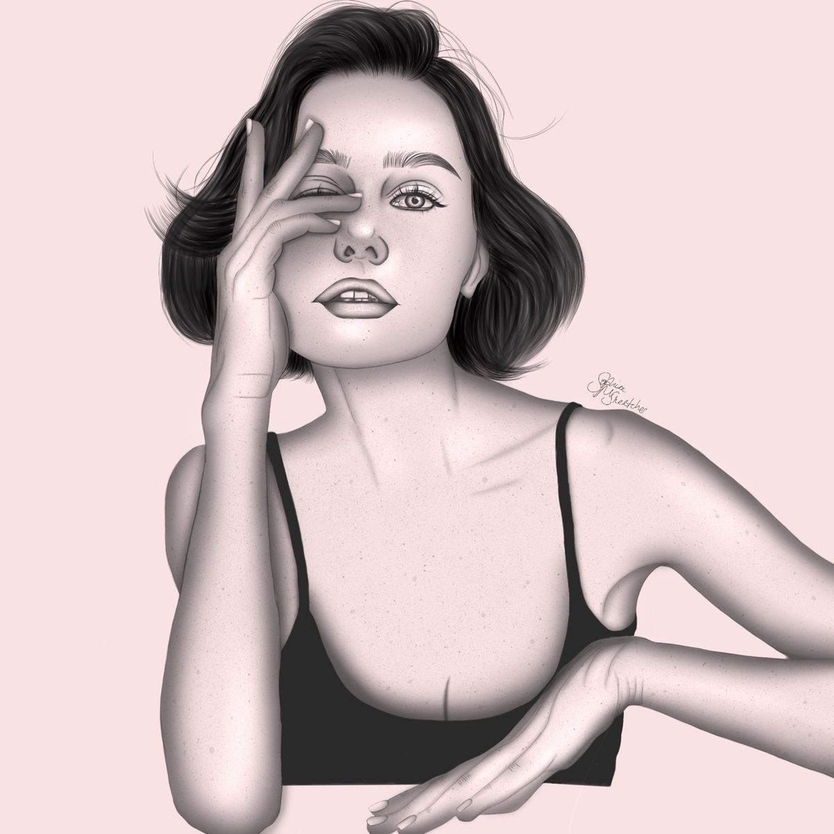
Digital Portrait Sketch 3
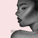
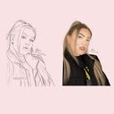
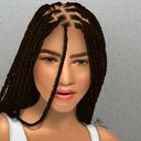
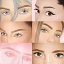
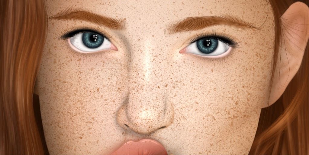
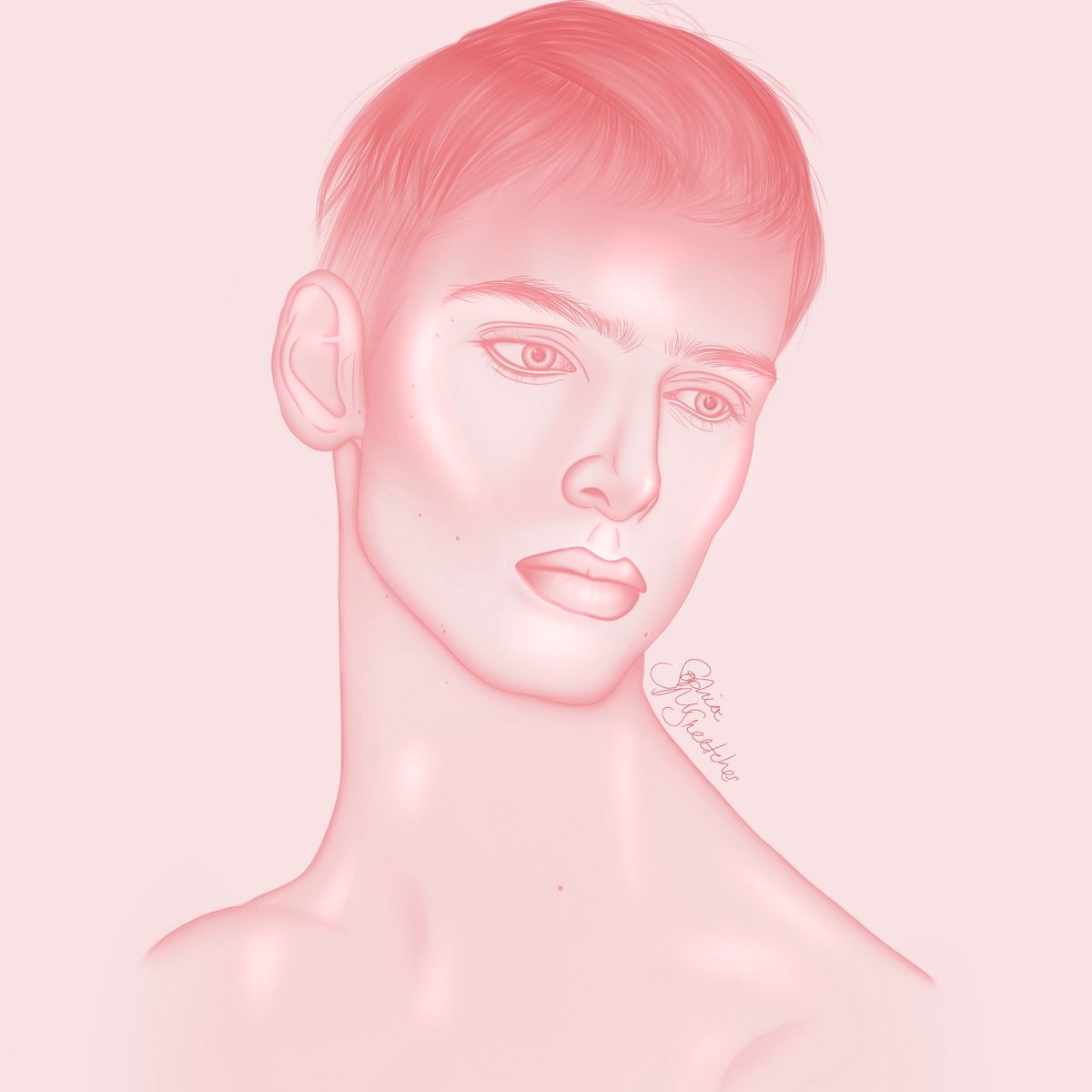
What do you think of this drawing? This is still one of my older pieces hence why it looks very similar to my other sketches. I shall be taking all critiques and working incorporating them within my next attempt at a digital ‘sketch’.Any support shown on this post is appreciated
 Apr 22, 2021
#portrait
#procreate
#girl
Comments
I love this piece, especially how you captured their body language, it all translates very well. I’m also OBSESSED with the hair, the amount of care and detail is incredible! I can appreciate for the most part how anatomy and perspective was considered, but I would recommend taking a little extra time while your first sketching, or even before you start drawing, to really take in the reference, and consider why things are the way they are, and how they will affect your drawing, and what steps you are taking to make sure everything lines up. Cohesiveness is key, and the good news is you’re definitely heading in the right direction. If I were to leave you with one quote, it’s that practice doesn’t make perfect, perfect practice does. Putting in the time is important, but there are things you can do to teach yourself more efficiently. Overall,
love it!

love it!
•
•The one thing I would recommend practice the first and foremost everything else is anatomy. Eyes and head are quite decent, but arms and lips need improvement

•
•Your shading lines seem a little harsh which takes away from the aspect of being realistic. The hair looks great, the blending is cohesive and over all well done. 

•
•This piece is already looking super good!
One small piece of advice i have to try and soften the harsh lines you used as shadows - look at the boobs and the nose between the eyes for example. It's a really harsh and dark line on relatively light areas so it sticks out quite a bit. Try to soften the transition between shadows and skin and blend the lines a bit, that'll make it look more natural, soft and realistic.
But all in all this is already a really solid piece!
Just keep on practising

One small piece of advice i have to try and soften the harsh lines you used as shadows - look at the boobs and the nose between the eyes for example. It's a really harsh and dark line on relatively light areas so it sticks out quite a bit. Try to soften the transition between shadows and skin and blend the lines a bit, that'll make it look more natural, soft and realistic.
But all in all this is already a really solid piece!
Just keep on practising
•
•So everyone is saying to “add texture” “add detail”. But I would disagree.
But putting values in the right place is so much more important. Especially since it’s a black and white portrait, because values are all you got. If it wasn’t for values you would have a blank white square. Values are even more important than textures, details and even proportions sometimes.
Take a look at your reference and compare it to your drawing and always ask yourself when trying to judge a spot on your drawing
“How close is this shadow to pure white?”
“How close is this shadow to pure black?”
And while looking at your reference and drawing ask yourself
“Is my highlights too bright?”
“Is my shadows too bright?”
A very very very common mistake is that artist shade way too light. They are afraid to go dark. If your drawing doesn’t have a full range of values (Black-White) then it’s going to look flat and faded at best.
Now one perfect example is the hair. I think you got the hair perfect. Absolutely nailed the dark dark values in the hair. Perfect. But in other areas it looks like you didn’t follow through with your dark shadows. Most of your values in the rest of your portrait are a kinda light grey. So don’t be afraid to go pure black pure white and every value in between! You are doing really good so far!

But putting values in the right place is so much more important. Especially since it’s a black and white portrait, because values are all you got. If it wasn’t for values you would have a blank white square. Values are even more important than textures, details and even proportions sometimes.
Take a look at your reference and compare it to your drawing and always ask yourself when trying to judge a spot on your drawing
“How close is this shadow to pure white?”
“How close is this shadow to pure black?”
And while looking at your reference and drawing ask yourself
“Is my highlights too bright?”
“Is my shadows too bright?”
A very very very common mistake is that artist shade way too light. They are afraid to go dark. If your drawing doesn’t have a full range of values (Black-White) then it’s going to look flat and faded at best.
Now one perfect example is the hair. I think you got the hair perfect. Absolutely nailed the dark dark values in the hair. Perfect. But in other areas it looks like you didn’t follow through with your dark shadows. Most of your values in the rest of your portrait are a kinda light grey. So don’t be afraid to go pure black pure white and every value in between! You are doing really good so far!
•
•Love this!! Consider taking a closer look at the shadows on your reference. It feels as though you've placed the shadows where you think they should be rather than where they are. I am not really understanding where the light source is, though right now it feels like the character is front-lit. Pay attention to the comparative tones of your shadows. An example of this would be that the shadow under the armpit should be darker than that in the shoulder, because the top of the body would be receiving bounce light from the ceiling. Shadows follow the form, so my guess is that the shadows on the breasts are not flat, and there might be an occlusion shadow where the two breasts meet.
Keep pushing tonal values and observing from your reference! It's a lovely piece and it's the little details that will make it sing.
Keep pushing tonal values and observing from your reference! It's a lovely piece and it's the little details that will make it sing.
•
•You did a very good job on the face, especially the smaller detail that give it a realistic look. I would recommend though to study how shadows and lightning works. The airbrush look can work for shadowing but can look a bit weird if not careful.
•
•this looks good! I’m agreeing with the other comments about the hand, I think it looks a bit unnatural with the lines and where those knuckle bones fall on the hand

•
•This looks so prettyy  I would probably also agree with the other comments: maybe add some more detail to the skin.
It looks a little unfinished as there are detailed creagses in the hands, but nowhere else on the rest of the body/face. Also, the hands look slightly too big (especially the hand on the table). Try to draw the fingers as if they are arching upwards (as opposed to curving downwards like the middle finger especially)
But honestly, this looks amazing! You should be proud
 I would probably also agree with the other comments: maybe add some more detail to the skin.
It looks a little unfinished as there are detailed creagses in the hands, but nowhere else on the rest of the body/face. Also, the hands look slightly too big (especially the hand on the table). Try to draw the fingers as if they are arching upwards (as opposed to curving downwards like the middle finger especially)
But honestly, this looks amazing! You should be proud
•
•I agree with the other posts. Pay attention to the hand. There are some lines that don’t seem natural on the top of the wrist. The hair looks nice and fluffy which I love.

•
•This looks really cool! I agree with everything that was said on the other comment so I'm just gonna say that this is overall a good job, keep it going!

•
•this looks awesome!!! i think it would be cool to add a little bit more texture to the skin and some more shading to add subtle details like the highlights and shadows around the collar bones and under the eyes

•
•