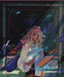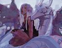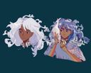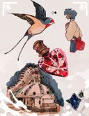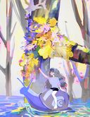


Greetings from a harpy | wip 2 |
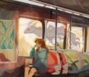
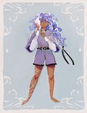
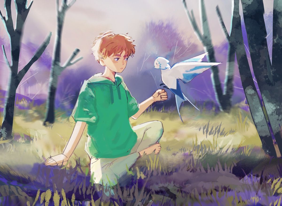
I tried taking all the critique I was given to improve this drawing so here is what it looks like rn.I ended up changing his pose and I changed the harpy to appear like it’s about to land on the boy’s hand. I changed a ton T~T I’m so burnt out
I don’t really like all the changes I made if I’m being honest and I might just shelve this drawing entirely but I thought I’d give it one more chance.
I’d really appreciate critique on the pose of the boy and the overall composition. I feel as if I’ve both overworked the drawing and haven’t worked on it enough, which I probably did somehow lol.
Critique of anything besides what I’ve mentioned is welcome too ty!Jan 9, 2023
#landscape
#sketch
#procreate
#harpy
#wip
Comments
Ohhhh I really like this drawing! The anticipating that there is because the bird is almost landing makes it a bit magical I feel like c:. I also love that you kept the background minimalistic wich makes the focus the boy and bird pop out sooo much more!
I think the weight of the boy is weird, together with the legs. With that pose I feel like he should be leaning more backwards then he is, it seems like there is no weight on the hand he is "leaning" on and the backside of his back. The legs seem to be just put under the boy. I can't explain it better sorry orz. It just doesn't seem to be interacting with the envirment c:. I would also add more shading to the wings to give it more of a feathery definition of it was me. But that might just be a stylistic chooice
Overall I really adore this piece! I like the idea so much and I like how you did it c:. Don't burn yourself out by this piece ^^. Take plenty of rest let everything sink in and then if you want to work on the piece. Good luck

I think the weight of the boy is weird, together with the legs. With that pose I feel like he should be leaning more backwards then he is, it seems like there is no weight on the hand he is "leaning" on and the backside of his back. The legs seem to be just put under the boy. I can't explain it better sorry orz. It just doesn't seem to be interacting with the envirment c:. I would also add more shading to the wings to give it more of a feathery definition of it was me. But that might just be a stylistic chooice
Overall I really adore this piece! I like the idea so much and I like how you did it c:. Don't burn yourself out by this piece ^^. Take plenty of rest let everything sink in and then if you want to work on the piece. Good luck
•
•
I would, like the other people said, make it so his right leg goes up a little?? Idk how to describe that-
And also I’d relax the hand reaching out to the bird so it doesn’t look like he’s about to punch it lol

And also I’d relax the hand reaching out to the bird so it doesn’t look like he’s about to punch it lol
•
•Looks good! Ganbatte! Only thing that stands out to me is the highlight on the leg facing us seems forced and doesn’t match the shape of the leg or the shadow the arm would cast.

•
Oo this looks really good! Only thing i’d say is that his legs look a lil funky, like hes sitting on them, you might want to try giving him a bit more leg & butt and add some depth if you know what i mean? Other than that looks great!

•