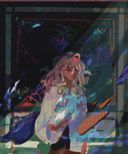


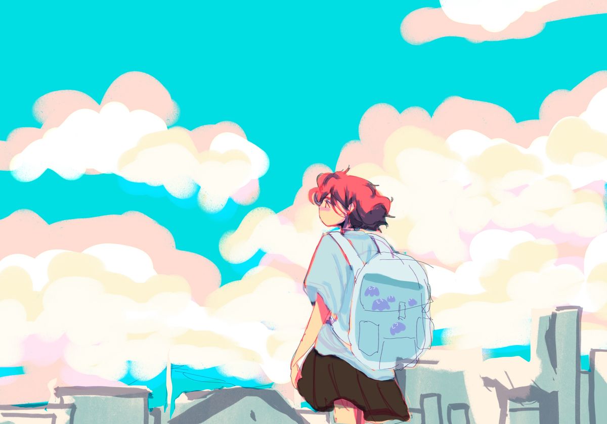
Sightseeing with little companions (wip)
I started this drawing but there are some things that look off to me and I can’t figure what and how to fix them.Part of the problem might be the colors, this is a color palette I’m unfamiliar with and idk if this combination looks good together or not?
I would rlly appreciate thoughts on the composition as well. I’m wondering if I should change it or leave as is.
Feel free to point out anything, I don’t think I’m being specific enough about what to critique but any advice is welcome!
Thank you!Jul 25, 2021
#oc
#characterart
#conceptart
#sketch
#procreate
Comments
Maybe add some purple blue and greenish colours to the bottom of the clouds and add some more color variation to the blue of the sky other then that I really like it

•
I love your drawing, I recommend you to give some "life" or movements to the clouds, and your colors are very good

•
•And yes definitely add some dimension to the sky. But the palette looks good, and I really like how the hair stands out right away

•
Oh i know maybe adding like a gradient to the colour of the sky like dark to light towards the cloudssss :D ifff that makes senseee!

•
•I rlly like the colors and the layout but I think I'd make the clouds a bit more wispy and spread out!

•
•Hmmm... I'd move the character slightly to the right, following the rule of thirds for a clear composition. Same, possibly pushing the building skyline up, making them darker or possibly seem further away (not sure about that, though - I'd try putting a grid over the painting, move key elements around and see what works best, but never be too dependent on it. Can get restrictively and artificial). Making the buildings darker might be enough to push the values a bit. This is overall a very promising piece and I look forward to see where you take it! Colors are lovely! Play around with people's suggestions (many excellent ones) and you'll absolutely end up with something stunning!!
•
•Hello! Your WIP is very pretty!
I agree with the rest of the comments on defining the space around the character some more. And making the backpack with the fish pop more (I didn't notice it was water at all at first, I guess if you add more light and shadow and make the fish red that will be fixed. Alternatively you could make the shirt a different color, so that the blues don't blend together.)
I would only add to maybe tone down the saturation of the sky. I would try making it the same color as the characters shirt. That way it does not compete with the saturated red of the hair and leaves the focus on the character. It would also "calm" the scene down some more, if that is what you are going for.
Good luck and have fun with the rest of your beautiful illustration!

I agree with the rest of the comments on defining the space around the character some more. And making the backpack with the fish pop more (I didn't notice it was water at all at first, I guess if you add more light and shadow and make the fish red that will be fixed. Alternatively you could make the shirt a different color, so that the blues don't blend together.)
I would only add to maybe tone down the saturation of the sky. I would try making it the same color as the characters shirt. That way it does not compete with the saturated red of the hair and leaves the focus on the character. It would also "calm" the scene down some more, if that is what you are going for.
Good luck and have fun with the rest of your beautiful illustration!
•
•I think I’d just build on the comments about perspective, I’d either get rid of the buildings or add more information about where the person is standing (a higher bridge/ stairs etc) so that it makes more sense
I’d maybe make the buildings fade more in the background cuz atm the persons legs and the building s are kinda blending together if you get what I mean?
Though overall I think this is very well made! The colors are lit!!!

I’d maybe make the buildings fade more in the background cuz atm the persons legs and the building s are kinda blending together if you get what I mean?
Though overall I think this is very well made! The colors are lit!!!
•
•Hello, Bezuzu here 
From the perspective you’ve taken, I can make out that she’s maybe travelling uphill or standing on a far high zone? Maybe be a little specific? Letting your audience choose is also fine but I think most would not want to get lost figuring out what they are seeing. So maybe if she’s going uphill add like a railway sign, lampposts, stop signs, etc. and if she’s standing afar then maybe some railings to denote that. I don’t see any problem with the colour palette rather I find it extremely beautiful and soothing to look at. It’s just that your environment looks incomplete and vague so add in some elements.
I hope that helps!!
Do your best

From the perspective you’ve taken, I can make out that she’s maybe travelling uphill or standing on a far high zone? Maybe be a little specific? Letting your audience choose is also fine but I think most would not want to get lost figuring out what they are seeing. So maybe if she’s going uphill add like a railway sign, lampposts, stop signs, etc. and if she’s standing afar then maybe some railings to denote that. I don’t see any problem with the colour palette rather I find it extremely beautiful and soothing to look at. It’s just that your environment looks incomplete and vague so add in some elements.
I hope that helps!!
Do your best
•
•I love the colour palette! The warm colours against the cooler colours is very nice.
It may be due to the perspective, but the buildings do not seem to add much to the illustration. I suggest showing more of the buildings and a bit less of the sky (lowering the "camera", if you will). Especially if the narrative is about sight seeing, it would be nice to see more interactive elements (lighting, shading) with the background buildings.

It may be due to the perspective, but the buildings do not seem to add much to the illustration. I suggest showing more of the buildings and a bit less of the sky (lowering the "camera", if you will). Especially if the narrative is about sight seeing, it would be nice to see more interactive elements (lighting, shading) with the background buildings.
•
•I think the color palette is good, but maybe there is too much empty space up above. I think cropping it off or lower the perspective to see more of the buildings might work better. It will be a stronger piece even just cutting it off right at the top of that highest cloud to get rid of some that empty blue. Always love how whimsical your art looks.

•
•